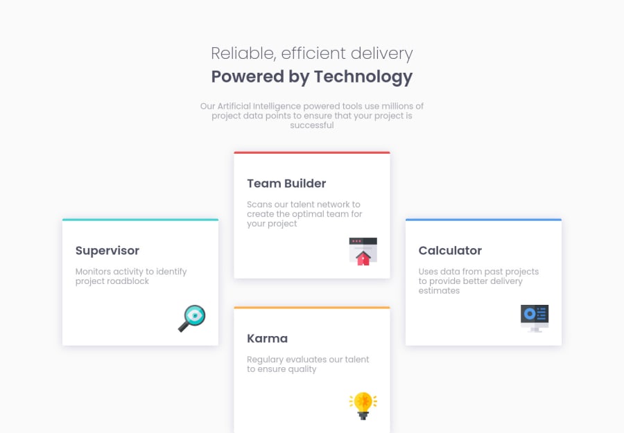
Four card feature section challenge hub without grid or flexbox
Design comparison
Solution retrospective
Hello, world! π
This is my first challenger, and i would like your watch it and tell what can i improve!! π
I use: β Reset CSS β Custom Properties β Media Query β BEM Methodology
If you want to support me, just follow me :D π LinkedIn: @andresglz01 π GitHub: @AndyGlz01 π Twitter: @AndresGlz01
Community feedback
- @BikeInManPosted almost 3 years ago
Nice work! But needs to adjust to small screens(responsiveness).
Marked as helpful1@AndyGlz01Posted almost 3 years ago@BikeInMan Hello! I'm learning about media queries right now, and i added a breakpoint for 450px! :)
Thanks for your comment! <3
0@BikeInManPosted almost 3 years ago@AndyGlz01. You were still working on it as I thought. Good to know.
1@BikeInManPosted almost 3 years ago@AndyGlz01 Yes, it is working on small screen sizes too. Good work. Must have been tough. You have seem to have a good grip on "positioning".
Some suggestions if you will:
- Do not set fixed height. If you have to, the use only min-height. Height easily causes overflow problems (scrollbars).
- Use a container or wrapper immediately after body and put everything inside it. And give that a min-height of 100vh. It works beautifully on mobile and avoids scrollbars on desktops.
- Now that you have mastered positioning. I think you should start learning flexbox and grid. They will make things a lot easier, for layouts.
Good Luck, Have a nice weekend.
Marked as helpful1@AndyGlz01Posted almost 3 years ago@BikeInMan Hello! Your comment helped me to see problems that were invisible to me, and I have already solved them (not completely), but in my other projects and in future ones it is something that I will take into account when laying out.
Thank you for your comments! <3
0 - @2divPosted almost 3 years ago
I have just finished this challenge but my code is simple and need more improvement. Have look and check my solution. By way i feel you code is more advance and complicated for me.
1 - @EmmanuelHexerPosted almost 3 years ago
Wow, nice work. Let's keep going forward. You can also check out how i did mine.
1
Please log in to post a comment
Log in with GitHubJoin our Discord community
Join thousands of Frontend Mentor community members taking the challenges, sharing resources, helping each other, and chatting about all things front-end!
Join our Discord