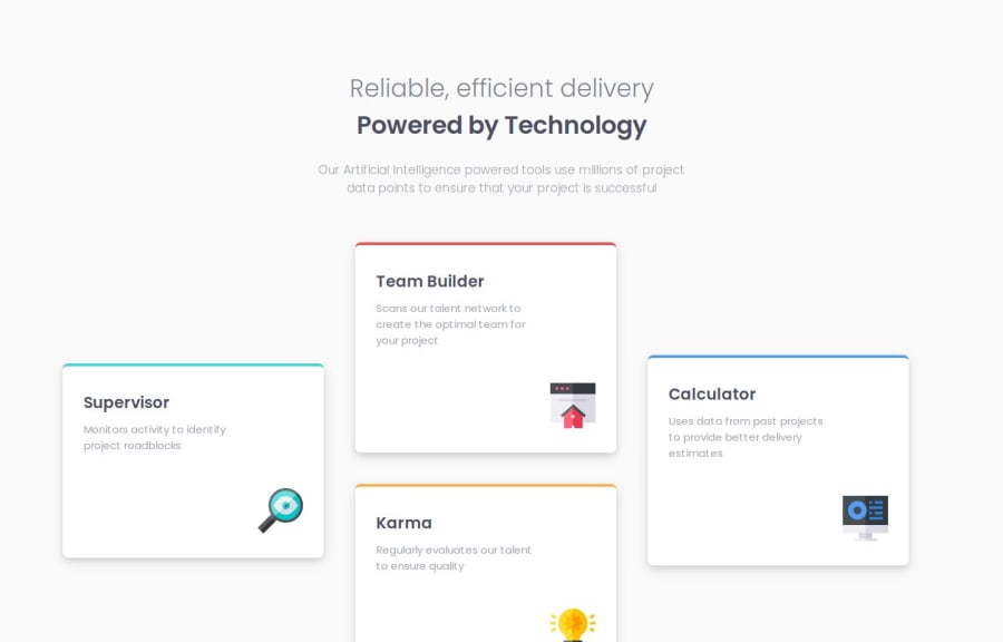
Four-Card-Feature-Section-by-hannibal
Design comparison
Solution retrospective
The grid part was really great to work on, i've learned so much on the way.
What challenges did you encounter, and how did you overcome them?The challenge was to figure out how to use the grid, so i looked through some docs and figured it out on my own.
What specific areas of your project would you like help with?any feedback would be helpful.
Please log in to post a comment
Log in with GitHubCommunity feedback
- @alexsantoswork
O design ficou parecido, somente o tamanho não ficou identico, mas no geral ficou muito bom. Fiz esse projeto tambem, mas não encontrei os arquivos de imagens dos ícones, usei ícones semelhantes do font awesome, gostaria de saber como fez para ter esses ícones?
Join our Discord community
Join thousands of Frontend Mentor community members taking the challenges, sharing resources, helping each other, and chatting about all things front-end!
Join our Discord
