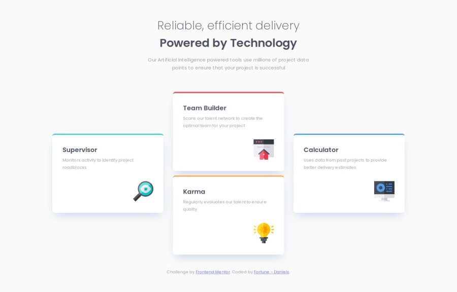
Design comparison
Solution retrospective
I am very proud of figuring out a method I can use to determine the number of rows or columns I need in a grid to achieve design layouts.
I am also pleased with my usage of the BEM naming convention. This helped me better understand what element is being styled. This also ensures that more styling can be added to the code without fear of breaking anything else.
What challenges did you encounter, and how did you overcome them?I initially struggled to understand how to set up the grid layout for the cards container. I also found a little bit of a challenge getting the sizing as close as I have in the final version.
I had to go back multiple time to calculate the percentage of the space that the elements needed to take up and work that into the code.
What specific areas of your project would you like help with?I am open to any advice on this.
Community feedback
- @alemdaphelanPosted 7 months ago
You did an excellent job. Congratulations, @DAJ350!
0
Please log in to post a comment
Log in with GitHubJoin our Discord community
Join thousands of Frontend Mentor community members taking the challenges, sharing resources, helping each other, and chatting about all things front-end!
Join our Discord
