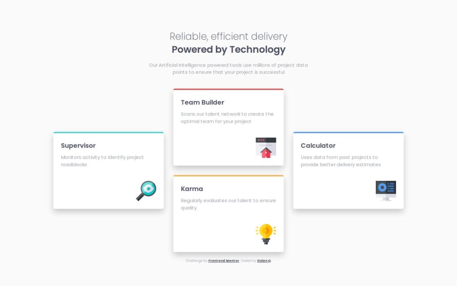


Design comparison

Solution retrospective
I am most proud of how I utilized flexbox and grid styling to simplify the code for the layouts between the different types of displays. Having control with these properties makes it so much easier than having to manually adjust the positioning of elements with padding and margins. The one thing I would do differently next time would be to use elements for the cards instead of ``s just because the code for the styling would have turned out so much cleaner. I will most likely update this in the future.
Having to understand the fundamentals of flexbox and grid was the biggest challenge. It was nice to have the help of some beginners guides to understanding these properties, but it was a challenge in of itself to test the different properties for this specific project. Though it was time consuming at first, having the knowledge of how to utilized these properties will for sure be much more efficient than adjusting each individual element.
What specific areas of your project would you like help with?Since the start of using flexbox and grid, I feel that I am still overcomplicating the properties. Although my code seemingly gets the job done, I feel as if the same output could be executed with much fewer lines of code. Any tips I will take!
Community feedback
- @Alex-Archer-IPosted 9 months ago
Hi!
At first I like this hover effect - it's smooth and cool =)
I can't see where you are overcomplicating with grid. Maybe using
autofor middle column - guess it's more neat when all the cards keeps the same width. But that isn't a big deal =)A bit grumbling about semantic - it's a list of the cards =)
Oh, and you mistyped a bit -
display: flexboxinsteaddisplay: flex. That's why flex doesn't work on the mobile screen. By the way, you also can change grid togrid-template-column: 1frjust to avoid adding new properties.So, great work, congrats =)
Marked as helpful1 - @YADAV0057Posted 9 months ago
did you forget to color your cards?
0@dquinn089Posted 9 months ago@YADAV0057
Can you elaborate? the only time colors are used is for the top-side border for each card to which I colored accordingly.
0@dquinn089Posted 9 months ago@YADAV0057 Nevermind I see what you mean. It's very subtle on my end so its hard to tell but I updated the background-color properties to the cards to white. I initially didn't notice because usually all colors used in the project are listed in the styles-guide file. Thank you for catching that though!
0


Please log in to post a comment
Log in with GitHub
Join our Discord community
Join thousands of Frontend Mentor community members taking the challenges, sharing resources, helping each other, and chatting about all things front-end!
Join our Discord