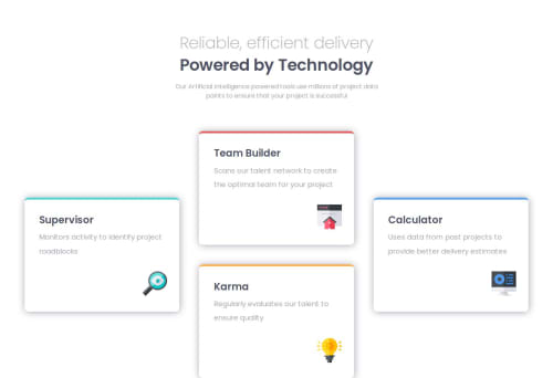
four-card-feature-section

Solution retrospective
Used grid first time, and it was a good experience. Just having uncertainties with the grid content and grid items. Beside that it was straight forward.
Next time i want to focus more on the main css structure until i go to styling. Had a lot back and forth with the font sizes.
What challenges did you encounter, and how did you overcome them?Matching the font-sizes with the design previews. In the end i just played with the values.
What specific areas of your project would you like help with?Not sure if it was a good idea to make the responsive font-size just in the body. Maybe it is better to apply different responsive font-size adjustments for headings and text. What do you mean?
Please log in to post a comment
Log in with GitHubCommunity feedback
No feedback yet. Be the first to give feedback on defPhisy's solution.
Join our Discord community
Join thousands of Frontend Mentor community members taking the challenges, sharing resources, helping each other, and chatting about all things front-end!
Join our Discord