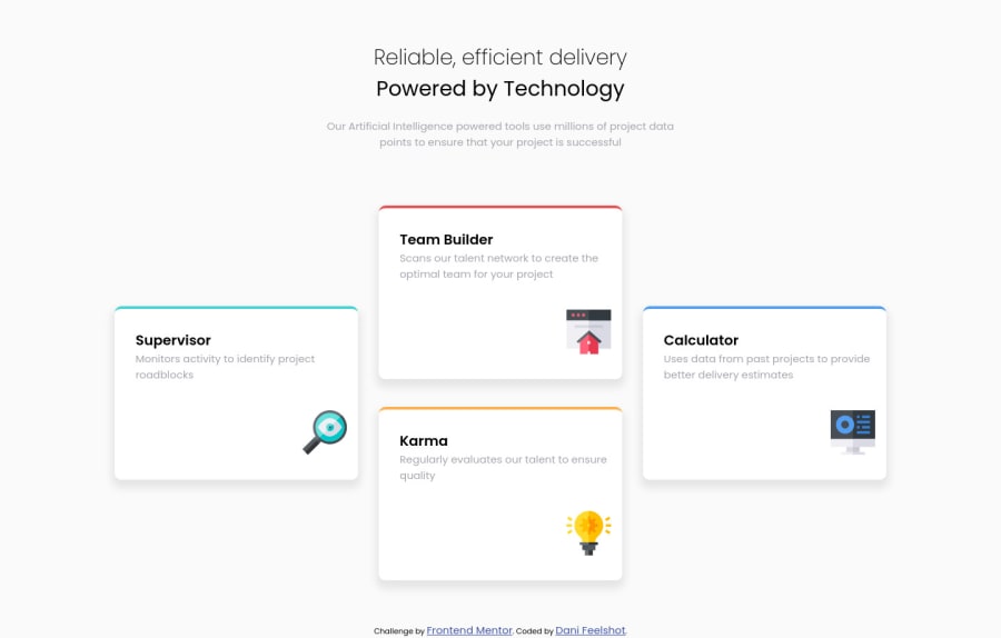
Design comparison
SolutionDesign
Solution retrospective
I have done this exercise again, implementing sass as a tool and in less time than it took me the first time I did it. Any comment adds a lot to my learning, thank you very much to all and success. :D
Community feedback
- @VCaramesPosted almost 2 years ago
Hey there! 👋 Here are some suggestions to help improve your code:
- Do not forget ⚠️ to check your FEM report, to see what is incorrect and update your code with it. This should be the first thing that should be done right after submitting the challenge.
- The “Reliable, efficient delivery Powered by Technology” is one single heading ⚠️ so the entire thing should be wrapped in a single
h1
heading along with aspan
element.
- The
article
element is not the best choice ❌ for wrapping these cards. In order to use thearticle
element the component needs to be able to make sense on its own and be independently distributable (can be used in on another site).
More Info:📚
- The “icons” in this component are purely decorative. ⚠️ Their
alt tag
should be left blank and have anaria-hidden=“true”
to hide them from assistive technology.
More Info:📚
[MDN Aria-Hidden] (https://developer.mozilla.org/en-US/docs/Web/Accessibility/ARIA/Attributes/aria-hidden#description)
- Your
CSS Reset
is being underutilized. 😢 To fully maximize 💯 it, you will want to add more to it.
Here are some examples that you can freely use:
If you have any questions or need further clarification, feel free to reach out to me.
Happy Coding! 🎆🎊🪅
0
Please log in to post a comment
Log in with GitHubJoin our Discord community
Join thousands of Frontend Mentor community members taking the challenges, sharing resources, helping each other, and chatting about all things front-end!
Join our Discord