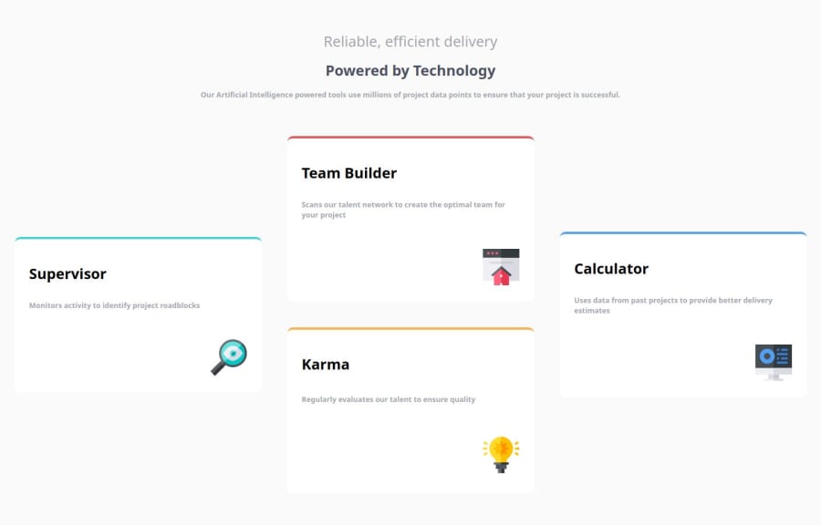
Design comparison
Solution retrospective
I am most proud of successfully implementing a clean, responsive layout using CSS Grid for the "Four Card Feature Section" project. The design adapts well across different screen sizes, ensuring a seamless user experience. The color scheme and typography also align with the project's goals, creating a visually appealing and professional look.
Next time, I would focus on enhancing the accessibility of the site. While the current design is responsive, improving features like keyboard navigation and adding more descriptive alt text for images would make the project more inclusive. I would also explore optimizing the code further to reduce load times.
What challenges did you encounter, and how did you overcome them?One of the main challenges was ensuring that the layout remained consistent across different screen sizes. Initially, the design looked uneven on smaller screens due to improper grid spacing. To overcome this, I utilized media queries and adjusted the grid template to be flexible, setting minimum and maximum widths to maintain the design’s integrity. I also spent time debugging alignment issues with images, which I resolved by applying consistent padding and using CSS Grid's justify-self property.
What specific areas of your project would you like help with?I would appreciate feedback on improving the performance and load time of the site, especially in terms of optimizing images and external resources like Google Fonts. Additionally, any suggestions on how to enhance the CSS Grid structure for better scalability would be helpful. Finally, I'd like guidance on making the code more accessible, particularly regarding best practices for screen readers and keyboard navigation.
Community feedback
- @StroudyPosted about 2 months ago
Exceptional work! You’re showing great skill here. I’ve got a couple of minor suggestions that could make this stand out even more…
- You should only have one
<h1>per page,
<h1 class="title_1">Reliable, efficient delivery</h1> <h1 class="title_2">Powered by Technology</h1>-
Having a clear and descriptive
alttext for images is important because it helps people who use screen readers understand the content, making your site more accessible. It also improves SEO, as search engines usealttext to understand the image's context, helping your site rank better, Check this out Write helpful Alt Text to describe images, -
For future project, You could download and host your own fonts using
@font-faceimproves website performance by reducing external requests, provides more control over font usage, ensures consistency across browsers, enhances offline availability, and avoids potential issues if third-party font services become unavailable. Place to get .woff2 fonts -
Using
remoremunits in@mediaqueries is better thanpxbecause they are relative units that adapt to user settings, like their preferred font size. This makes your design more responsive and accessible, ensuring it looks good on different devices and respects user preferences. -
While
pxis useful for precise, fixed sizing, such asborder-width,border-radius,inline-padding, and<img>sizes, it has limitations. Pixels don't scale well with user settings or adapt to different devices, which can negatively impact accessibility and responsiveness. For example, usingpxfor font sizes can make text harder to read on some screens, Check this article why font-size must NEVER be in pixels. In contrast, relative units likeremand adjust based on the user’s preferences and device settings, making your design more flexible and accessible. Usepxwhere exact sizing is needed, but prefer relative units for scalable layouts. If you want a deeper explanation watch this video by Kevin Powell CSS em and rem explained. Another great resource I found useful is this px to rem converter based on the default font-size of 16 pixel.
body,
html {
  font-size: 15px;
}
I hope you’re finding this guidance useful! Keep refining your skills and tackling new challenges with confidence. You’re making great progress—stay motivated and keep coding with enthusiasm! 💻
Marked as helpful0@EmicJoykillerPosted about 2 months ago@Stroudy Hi Steven,
Thank you so much for your detailed feedback and kind words! Your suggestions are incredibly helpful, and I’ll definitely work on implementing them to improve my project.
I’ll be sure to stick to one <h1> per page and create more descriptive alt text for better accessibility and SEO. I also appreciate the advice on hosting fonts locally and using rem or em units in media queries for better responsiveness—I'll make sure to adopt these best practices moving forward.
Thanks again for the encouragement and valuable insights! I’ll strive to be more accurate in my next steps. 😊
Best, Nikan
1@StroudyPosted about 2 months agoHey @EmicJoykiller, You got this! Happy to help. 💪
0 - You should only have one
Please log in to post a comment
Log in with GitHubJoin our Discord community
Join thousands of Frontend Mentor community members taking the challenges, sharing resources, helping each other, and chatting about all things front-end!
Join our Discord
