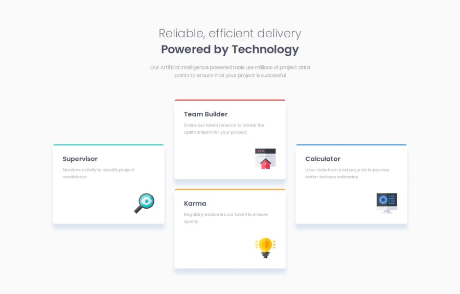
Design comparison
Solution retrospective
The box-shadow figma value of cards, I don't have it and it's a nightmare to retro-engineer.
Community feedback
- @jvondungenPosted 13 days ago
Hi @jeremymouzin. Looks like it's working perfectly! Not sure what was going on before, maybe it was my browser. Great job with this challenge!
0@jeremymouzinPosted 13 days ago@jvondungen Thanks for double checking, I'm glad it works on your side too 👍
0 - @jvondungenPosted 15 days ago
Nice job with this! Your HTML code is clean and easy to read. Your CSS is also well done. Your solution matches the design perfectly in desktop view.
I did notice that in mobile view your cards are a bit wide compared to the design. Think you can define the container width to be 311px to fix this.
0@jeremymouzinPosted 15 days ago@jvondungen Thanks for your feedback! I double checked and on a 375px wide screen my cards are exactly 311px wide already. I make them grow if you take a wider screen! Maybe you checked on a wider screen than 375px ? Could you check on a 375px wide screen and tell me if it's okay? Thanks.
0
Please log in to post a comment
Log in with GitHubJoin our Discord community
Join thousands of Frontend Mentor community members taking the challenges, sharing resources, helping each other, and chatting about all things front-end!
Join our Discord