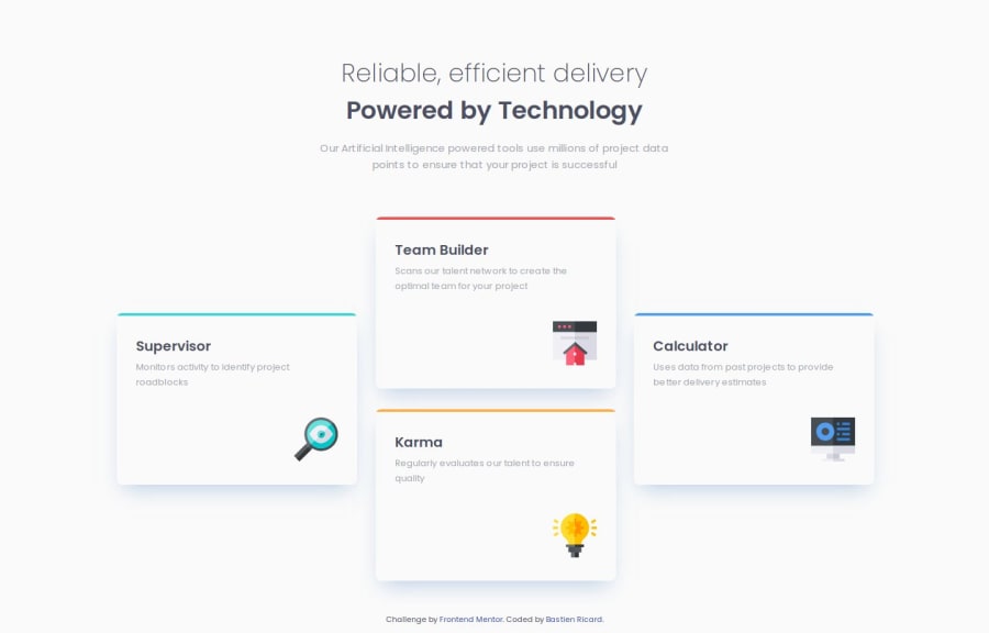
Design comparison
Community feedback
- @ubcyukinyPosted 2 months ago
Hello,
Congrats on completing the project!
You might want to update your solution site link from
https://bricard-dev.github.io/ftm_four-card-feature-section-master/tohttps://bricard-dev.github.io/ftm_four-card-feature-section/.Your code looks well structured and easy to follow, and matches the design very well.
I like how you used
::beforeto style the top border colors. I usedborder-topto style but your way matches the design better.The layout looks good on mobile and desktop and is responsive.
I can't think of any improvements. Really well done!
Marked as helpful1@bricard-devPosted 2 months agoHello @ubcyukiny!
Thank you very much for your feedback! You were absolutely right, I had changed the title of my repo but didn't update its link on the challenge...
1
Please log in to post a comment
Log in with GitHubJoin our Discord community
Join thousands of Frontend Mentor community members taking the challenges, sharing resources, helping each other, and chatting about all things front-end!
Join our Discord
