

Design comparison
SolutionDesign

Community feedback
- @myriamnguyendevwebPosted 3 months ago
Hi! Good job for trying the project.
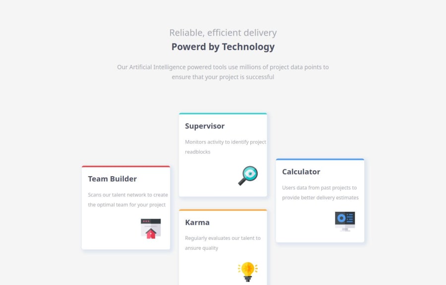
I don't know if you noticed, but there is a problem with the order of your cards compared to the original design. It's the one with cyan color on the left, after red at the top, blue on the right and yellow at the bottom. Pay attention to details.
In addition, the size of your cards is not good in terms of width. You put a size for the height.
The line break for the top paragraph is after the word "data".
0@MuriloP14Posted 3 months ago@myriamnguyendevweb o erro na ordem dos cartões foi intencional, uma vez que não consegui fazer com ordem correta, obrigado pela avaliação!
0


Please log in to post a comment
Log in with GitHubJoin our Discord community
Join thousands of Frontend Mentor community members taking the challenges, sharing resources, helping each other, and chatting about all things front-end!
Join our Discord