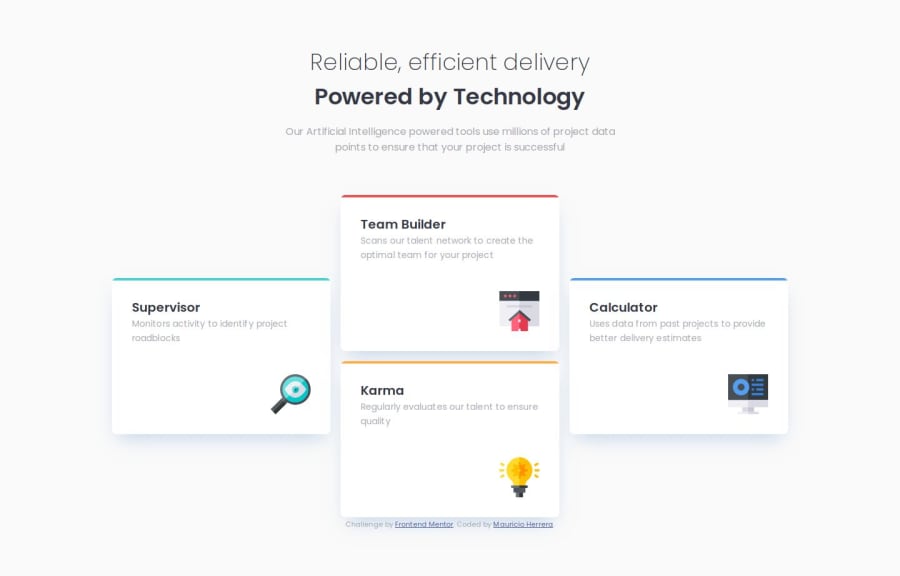


Design comparison

Solution retrospective
Built with Semantic HTML5 markup CSS custom properties Flexbox CSS Grid Mobile-first workflow
Continued development
- I want to learn how to think more in a CUBE CSS approach.
- I need to keep practicing with CSS Grid and responsive layouts.
- I want to give tailwind a try next.
What I learned Hardest part was getting the cards on the desktop layout. I had to use grid and it was a bit tricky to get the cards in the right place. I was trying to use flex and it wasnt working mostly because of the margin-top of the side cards. Then i pivoted to grid and it worked better, specially when you limit that view to a desktop media query. and you keep it flex simple on mobile.
position: relative; for .card creates a positioning context for absolute children (::before). At first I thought it would position the card relative to its own parent but actually relative means that the element stays in normal flow but you can add properties to it like top, left, right, bottom and then it will move. It also adds position context for absolute children which is what we wanted in this case to add the color bar on top of the card.
Community feedback
- @AdrianoEscarabotePosted 4 months ago
Hi newspaceracer, how’s everything? I think your project turned out great! However, I have some feedback that I think might be useful:
Avoid using the
<br>tag in your HTML code. While<br>might seem like a simple way to break lines, it is considered bad practice and can lead to significant accessibility concerns. For users who rely on screen readers, the presence of<br>can be announced, which disrupts the flow of the content and creates a confusing experience.Instead of
<br>, you should use semantic HTML to structure your content properly. For example, wrapping text in paragraphs (<p>) or using<div>containers for sections provides a cleaner and more accessible solution. This approach improves usability for screen readers and ensures that your content is presented in a meaningful way to all users.For more detailed guidance, refer to the MDN documentation on the
<br>tag: MDN: Accessibility Concerns of <br>Pro Tip: Accessible web development isn't just a recommendation—it's essential for ensuring inclusivity on the web!
The rest is amazing.
I hope this is helpful. 👍
1 - @snigdha-sukunPosted 5 months ago
Your solution is amazing. It matches the design perfectly. Also, your code was easy to understand. I really liked how you used flex for the mobile view & grid for the desktop view. I am a beginner & I learned a lot from your solution!
1


Please log in to post a comment
Log in with GitHub
Join our Discord community
Join thousands of Frontend Mentor community members taking the challenges, sharing resources, helping each other, and chatting about all things front-end!
Join our Discord