Design comparison
Please log in to post a comment
Log in with GitHubCommunity feedback
- P@joeleg96
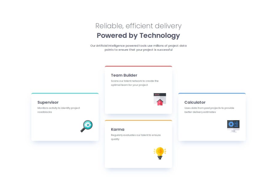
One thing that I would recommend, in order to make your code more condensed, is to give all the cards a common class name since they all have certain features in common: size, box shadow, margin, etc that way you don't have to give each individual card those css attributes. You can also give them unique class names, like the supervisor card "cyan" and the team builder card "red" that way you can target the border and change the color to it's respective color. Another thing, though this might just be me and I'm not sure if it's correct or not - but I feel like your webpage, though it transitions to the correct layouts, has a lot of things that are moving around, and it visually makes the page "confusing." For example, in the mobile layout, if you start to resize the page the title moves all over the place, and I feel like that just makes the transitions look a little clumsy. Again, maybe this is just me. Overall I think you did a great job in implementing each layout! Great job and good luck on your coding journey!
Join our Discord community
Join thousands of Frontend Mentor community members taking the challenges, sharing resources, helping each other, and chatting about all things front-end!
Join our Discord
