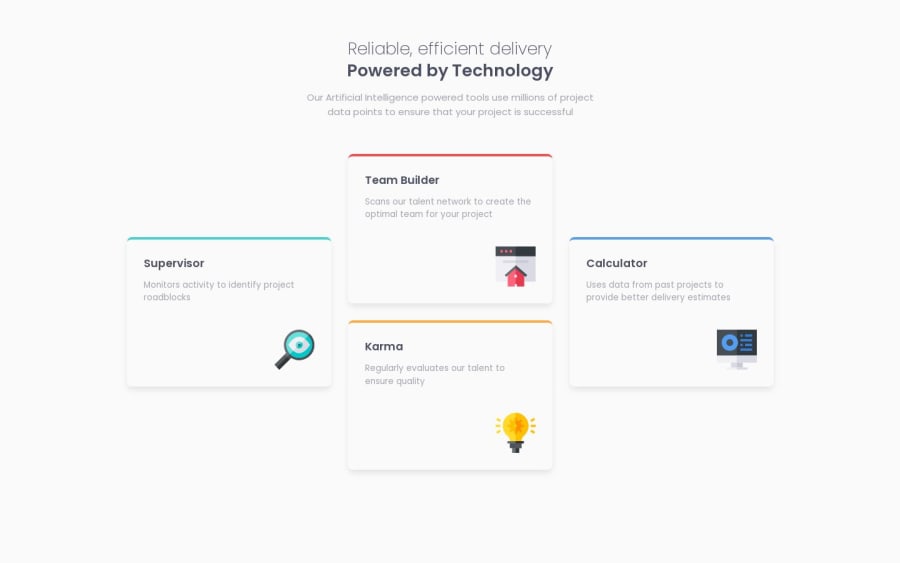
Design comparison
SolutionDesign
Community feedback
- @AGutierrezRPosted 11 months ago
Hello there 👋. Good job on completing the challenge!
I have some suggestions about your code that might interest you.
CSS and Styling:
-
You could use
grid-template-areato achieve the same result usinggrid-area.card_container { display: grid; grid-template-areas: ". team-builder ." "supervisor team-builder calculator" "supervisor karma calculator" ". karma ." gap: 1rem; margin-top: 2.5rem; }And set the
grid-areaof each card using a modifier class or something similar.card--supervisor { grid-area: supervisor; } .card--team-builder { grid-area: team-builder; } .card--karma { grid-area: karma; } .card--calculator { grid-area: calculator }
I hope you find this helpful 😁. Most importantly, your submitted solution is fantastic!
Happy coding!
Marked as helpful1 -
Please log in to post a comment
Log in with GitHubJoin our Discord community
Join thousands of Frontend Mentor community members taking the challenges, sharing resources, helping each other, and chatting about all things front-end!
Join our Discord
