Design comparison
Solution retrospective
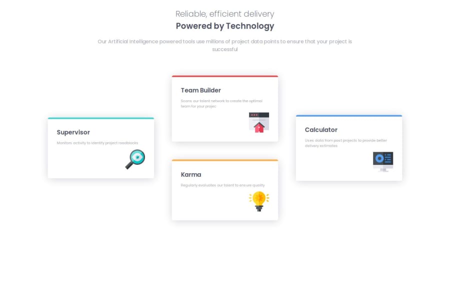
This was my first attempt at using grid in order to style the different sections of the page. I was happy with how I was able to use the "align-self" attribute to position and align the cards the way I wanted.
What challenges did you encounter, and how did you overcome them?Similarly to above, the most difficult part was certainly wrapping my head around grid for the desktop design. Specifically, I would say the most difficult part was figuring out that I would need 3 columns and 2 rows to actually make the layout that I wanted. I saw Kevin Powell recommend actually drawing over the design to figure out how many columns one would need, and that helped me.
What specific areas of your project would you like help with?Mostly on my CSS. If there is any feedback on how I used grid, that would be great.
Community feedback
Please log in to post a comment
Log in with GitHubJoin our Discord community
Join thousands of Frontend Mentor community members taking the challenges, sharing resources, helping each other, and chatting about all things front-end!
Join our Discord
