

Design comparison

Solution retrospective
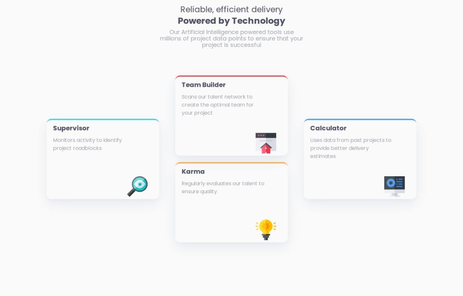
My usage of flexbox for placing the four cards was something im proud of
What challenges did you encounter, and how did you overcome them?My biggest challenging was figuring out the four cards placement, through using multiple layer of flexbox, the effect was achieved
What specific areas of your project would you like help with?Though i have used a media query for 375px and smaller devices, i still feel like the responsiveness of the website for different sizes seem wrong, and it sounds very exhausting to design different sizes for each different size, i'll need to research that.
Please log in to post a comment
Log in with GitHubCommunity feedback
- @AdrianoEscarabote
Hi TGF, how’s everything? I think your project turned out great! However, I have some feedback that I think might be useful:
Avoid using the
<br>tag in your HTML code. While<br>might seem like a simple way to break lines, it is considered bad practice and can lead to significant accessibility concerns. For users who rely on screen readers, the presence of<br>can be announced, which disrupts the flow of the content and creates a confusing experience.Instead of
<br>, you should use semantic HTML to structure your content properly. For example, wrapping text in paragraphs (<p>) or using<div>containers for sections provides a cleaner and more accessible solution. This approach improves usability for screen readers and ensures that your content is presented in a meaningful way to all users.For more detailed guidance, refer to the MDN documentation on the
<br>tag: MDN: Accessibility Concerns of <br>Pro Tip: Accessible web development isn't just a recommendation—it's essential for ensuring inclusivity on the web!
The rest is amazing.
I hope this is helpful. 👍
Marked as helpful - @dylan-dot-c
This is a good solution but there are a few ways you can improve.
- For responsiveness: you can do mobile-first design which builds websites for mobile users first then scale to desktop which is actually easier to do from small to large and not large to small.
- FlexBox Layout: At first an easy solution would be to use flexbox but grid is actually better and lets you have a higher format/control over the elements. So if you use a grid of 4*3(4 rows and 3columns) you can make it easier and more responsive instead of using flex.
- Another issue of responsiveness would be having such a low media query, 375px is good for most smartphones but there are some like the Galaxy Notes or Z Flips that are larger and that would make them see the desktop design with the 3 columns. This goes backs to doing mobile-first and then as you widen the screen you use media queries for the containers.
- You can also make use of semantic html like main, article, section to help screen readers. LIke use a <main> for
.main - Also try not to use 100vh or 100vw on elements as it causes problems on many areas and can make the website hard to debug, better to make the content flow naturally. ALso don't use 100vw as it doesn't count for the scrollbar and will cause an overflow like you have now, same for
100%as its redundant as all block level elements take up full width by default.
Anyways you have done well and there are a few more places you can improve on. ALl the best, take care.
Marked as helpful


Join our Discord community
Join thousands of Frontend Mentor community members taking the challenges, sharing resources, helping each other, and chatting about all things front-end!
Join our Discord