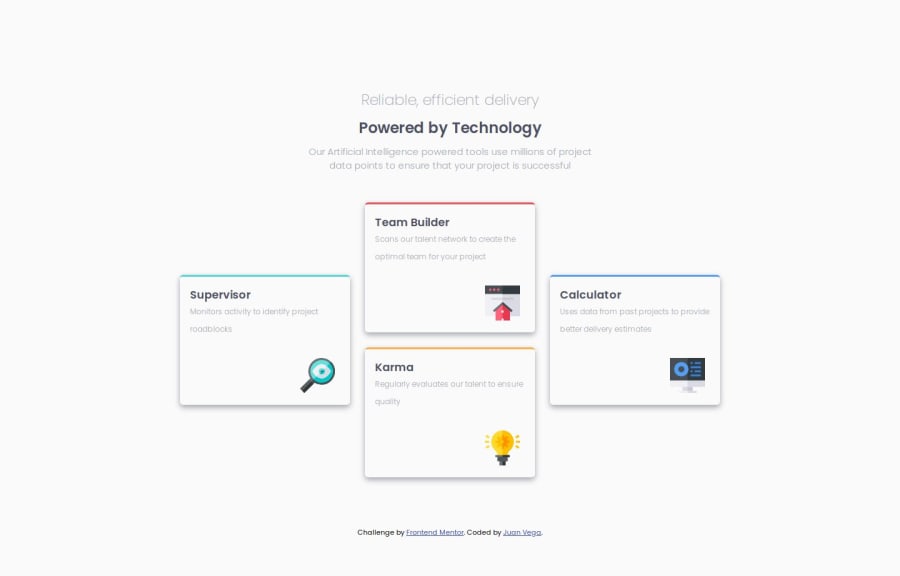
Design comparison
Solution retrospective
Challenge faced on this problem was getting the page to center on bigger screens. Thankfully I was able to do this fairly simply after doing some research. Setting my html and body tag to a height of 100%. Next was adding display: table, margin auto to my html element. And finally I set my body tag to display: table-cell and vertical-align: middle. This made it easier to see how the page centered on any screen size.
Community feedback
- @jcgoodwin86Posted 6 months ago
I did the card layout with Grid to practice using it more, but I struggled. The way you did it with Flexbox looks more simple 👍. Centering with table-cell is interesting. Did you tried it with Flexbox or Grid? If you set
body: 100vh;you can center it with flexbox.1@JuanTwoFourPosted 6 months agoThanks! I like taking the reference image and drawing boxes over the elements that way I can visualize the space I have to work with and what display type will work best. I tried centering with flex but for some reason it would always center vertically but not horizontally. I may have been doing something wrong though, I will try your suggestion next time! @jcgoodwin86
0
Please log in to post a comment
Log in with GitHubJoin our Discord community
Join thousands of Frontend Mentor community members taking the challenges, sharing resources, helping each other, and chatting about all things front-end!
Join our Discord
