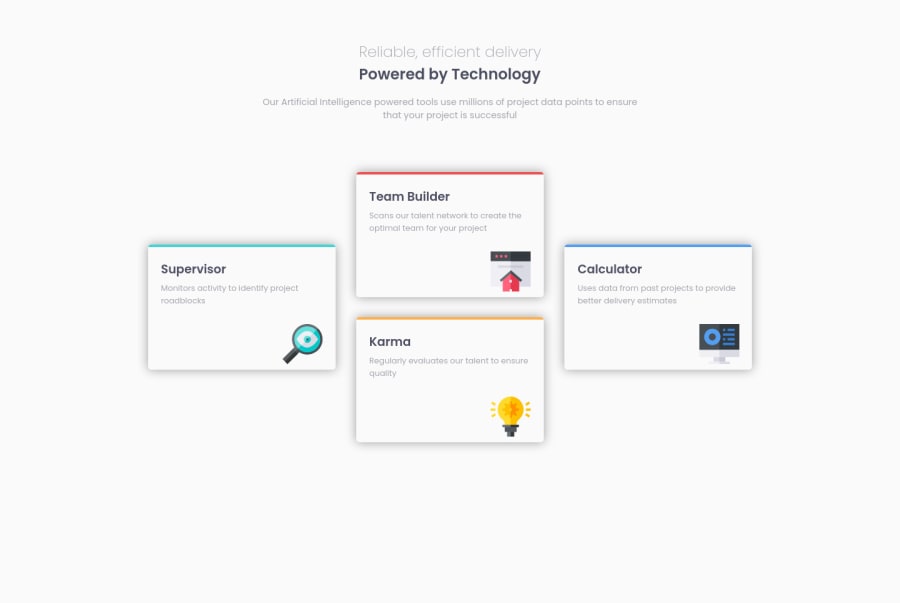
Design comparison
Solution retrospective
As I started from mobile first approach, I had few problems while transferring from flex to grid.
I used fixed height for the elements (boxes) so they wouldnt fill out all the space in the columns, would you use somekind od a different approach?
Community feedback
- @AdrianoEscarabotePosted almost 2 years ago
Hello Dorian, how are you? I truly loved your project's outcome, however I have some advice that I hope you'll find useful:
<h1 class="main-heading">Reliable, efficient delivery</h1>
<h1 class="main-heading-bold">Powered by Technology</h1>
The most appropriate in this case would be just an
h1tag! containing the two contents, to make them break a line, we can use a max-width, and for the styling we can use a span element with the content that will be changed!The main tag must be present in every HTML document so that we can recognize the main content. To fix this, wrap the main content in the main tag. Users of assistive technology will have a better navigation experience on your site thanks to the use of HTML5 landmark elements.
The remainder is excellent.
I hope it's useful. 👍
0
Please log in to post a comment
Log in with GitHubJoin our Discord community
Join thousands of Frontend Mentor community members taking the challenges, sharing resources, helping each other, and chatting about all things front-end!
Join our Discord
