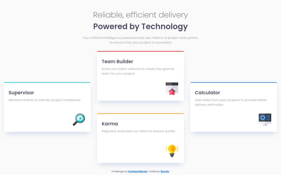
Design comparison
Solution retrospective
I worked with CSS Grid so any feedback would be greatly appreciated.
Community feedback
- @correlucasPosted over 2 years ago
👾Hello Romila, congratulations for your new solution!
I saw your live site and everything is great, the container is full responsive, the card design is perfect, the box-shadow is smooth. The only thing you really can change is the mobile version after
900px. See my tips below:Instead of using
max-width: 380px;if you replace withmax-width: 100%;you'll not that the cards will be responsive and taking the screen full width and you'll not have a big gap because the card will be not limited bymax-width: 380px;. Do this text to see the difference:.box { max-width: 100%; padding: 2em 1.5em 7em 1.5em; background-color: #fff; border-radius: 7px; margin-bottom: 2em; position: relative; box-shadow: 0px 15px 30px -11px rgb(131 166 210 / 50%); overflow: hidden; }👋 I hope this helps you and happy coding!
Marked as helpful1@romila2003Posted over 2 years ago@correlucas Thanks Lucas, I appreciate the helpful comment. I did not use the
max-widthof100%because of how wide it stretches too much, particularly in the desktop version and instead wanted to look similar to the design as possible. Instead, I changed mymax-widthto make the card longer, to prevent too much whitespace around. But thanks again for the comment, I appreciate it.1
Please log in to post a comment
Log in with GitHubJoin our Discord community
Join thousands of Frontend Mentor community members taking the challenges, sharing resources, helping each other, and chatting about all things front-end!
Join our Discord
