Design comparison
Please log in to post a comment
Log in with GitHubCommunity feedback
- @QBERT18
Hey! Sorry but i'am seeing you guys posting the same comment on literally every solution you see. Stop please farming points by posting unhelpful comments. I mean yeah you are right on some points, but as a web developer i know that the stuff you saying aren't that necessary. So please stop cheating.
- Account deleted
Hey there! 👋 Here are some suggestions to help improve your code:
- To center you content to your page, add the following to your Body Element:
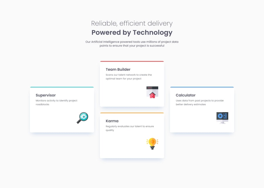
body { min-height: 100vh; display: grid; place-content: center; }- To give your HTML code structure, you want to set up your code in the following manner:
<body>
   <header></header>
   <main>
      <section>
            <div class="supervisor-card"></div>
            <div class="team-card"></div>
            <div class="karma-card"></div>
            <div class="calculator-card"></div>
      </section>
   </main>
</body>
The Header Element represents the your site’s introductory content.
The Main Element identifies the main content of your content..
The Section Element is used to wrap content that is related to each other, which these four cards are.
Lastly, since none of the cards can stand on their own, a simple Div will do for each card.
-
The “Reliable, efficient delivery Powered by Technology” is one single heading so the entire thing should be wrapped in a single <h1> Heading along with a Span Element.
-
The icons serve no other purpose than to be decorative; They add no value. There Alt Tag should left blank and have an aria-hidden=“true” to hides it from assistive technology.
If you have any questions or need further clarification, let me know.
Happy Coding! 👻🎃
Join our Discord community
Join thousands of Frontend Mentor community members taking the challenges, sharing resources, helping each other, and chatting about all things front-end!
Join our Discord
