Design comparison
SolutionDesign
Community feedback
- @mostafajr10psgPosted 7 months ago
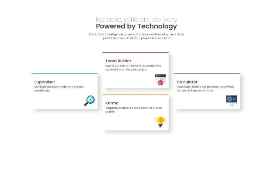
Congratulations Bro, There are some simple mistakes. 1- It's better to do Margin top and bottom in the paragraph “Powered by Technology ”
2- the color of some fonts you need to change it 3- you need to use line-height So that there is a good distance between the lines. That’s All And Good Luck.0
Please log in to post a comment
Log in with GitHubJoin our Discord community
Join thousands of Frontend Mentor community members taking the challenges, sharing resources, helping each other, and chatting about all things front-end!
Join our Discord
