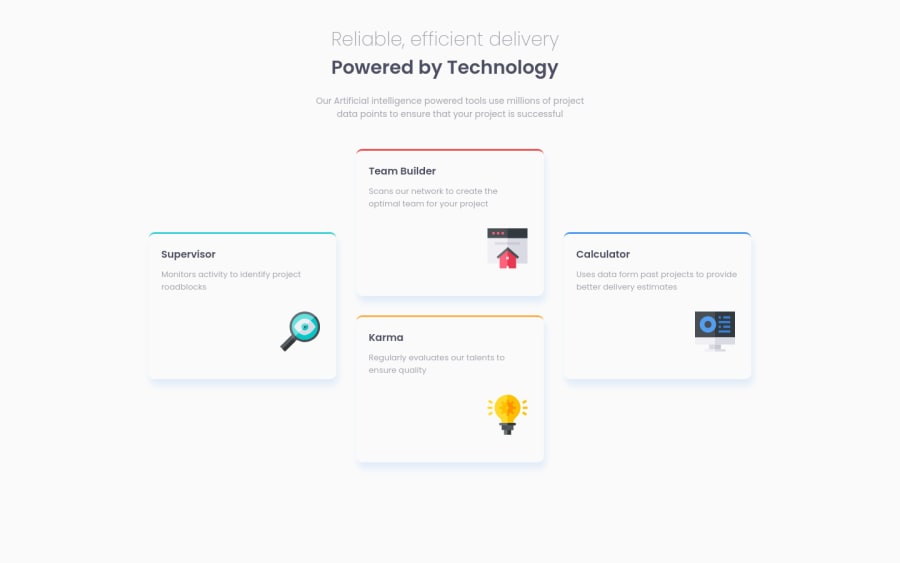
Design comparison
Community feedback
- @VCaramesPosted about 2 years ago
Hey there! Here are some suggestions to help improve your code:
- To give your HTML code structure, you want to set up your code in the following manner:
<body>
   <header></header>
   <main>
      <section>
            <div class="supervisor-card"></div>
            <div class="team-card"></div>
            <div class="karma-card"></div>
            <div class="calculator-card"></div>
      </section>
   </main>
</body>
The Header Element represents introductory content.
The Main Element identifies the main content of the document.
The Section Element can be used to wrap content that is related to each other.
And since none of the cards make sense on their own, a simple Div will do for each card.
-
The “Reliable, efficient delivery Powered by Technology” is one single heading so the entire thing should be wrapped in a single <h1> Heading along with a Span Element.
-
Reduce the
border-radiusof the card components to better match the FEM example. -
Using CSS Grid with Grid-Template-Areas will make things way easier when building the layout; it will give you full control of the layout.
-
Implement a Mobile First approach 📱 > 🖥
With mobile devices being the predominant way that people view websites/content. It is more crucial than ever to ensure that your website/content looks presentable on all mobile devices. To achieve this, you start building your website/content for smaller screen first and then adjust your content for larger screens.
If you have any questions or need further clarification, let me know.
Happy Coding! 👻🎃
Marked as helpful0
Please log in to post a comment
Log in with GitHubJoin our Discord community
Join thousands of Frontend Mentor community members taking the challenges, sharing resources, helping each other, and chatting about all things front-end!
Join our Discord
