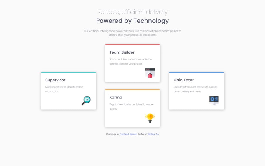
Responsive landing page using Mediaquery breakpoints
Design comparison
Solution retrospective
Hi... This is my first challenge after I learnt a little of HTML and CSS. I did make the page responsive. For me it looks like a very few lines of code using simple tags and styling. Do let me know if its wrong or right to write HTML and CSS like this.
the solution code i checked was almost double the code of mine and so many things which I was not aware of. So, let me know what is Right.
Community feedback
- @12KentosPosted almost 2 years ago
Hey @likhitha89,
Congrats on completing your first challenge! I think you did a great job. :)
As for your questions, I think it's totally fine you have less code than some other people do, if it works, and is efficient that's the main thing that matters. There are a LOT of different ways to accomplish the same task when it comes to coding, as you continue you will learn best practices and what solutions work better. Overall great job and continue the great work!
One piece of advice I do have, is I noticed in your code you selected some elements directly like so.
h3 { margin :0 auto 10px auto; font-size: 20px; }
Personally I would advise against doing this. In a small project like this, it wouldn't really matter, but in a larger project you will very likely end up with multiple h3 elements across a sight, that need different styling. And this would universally affect all of them.
Keep up the great work!
Marked as helpful0@likhitha89Posted almost 2 years agoHello@12Kentos
Thankyou. This keeps me encouraged to continue my learning.
And yes, I will try to use a class or id or combine selectors when necessary while styling insted of selecting them directly. Your advice is really helpful.
0
Please log in to post a comment
Log in with GitHubJoin our Discord community
Join thousands of Frontend Mentor community members taking the challenges, sharing resources, helping each other, and chatting about all things front-end!
Join our Discord