Design comparison
Solution retrospective
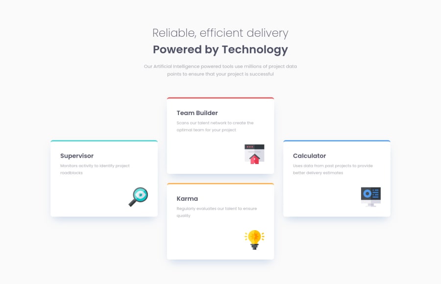
This challenge went relatively smoothly. I solved it using an inner grid inside the grid on the features section. I also learned that using max-width on sections instead of margin/padding can make the page more responsive on different screen sizes. All in all really enjoyed it!
Any feedback is welcome
Cheers!
Community feedback
- @VCaramesPosted about 2 years ago
Hey there! 👋 Here are some suggestions to help improve your code:
-
Move the background color to the
Body
element to have it take up the entire container. -
To properly center your content to your page, you will want to add the following to your
Body
element (this method uses CSS Grid):
body { min-height: 100vh; display: grid; place-content: center; }
-
You can delete this
<div class="container">
; it is not necessary. -
Using CSS Grid with
Grid-Template-Areas
will make things way easier when building the layout; it will give you full control of the layout.
Here is an example of how it works: EXAMPLE
-
The “icons” serve no other purpose than to be decorative; They add no value. Their
Alt Tag
should left blank and have anaria-hidden=“true”
to hide them from assistive technology. -
Implement a Mobile First approach 📱 > 🖥
With mobile devices being the predominant way that people view websites/content. It is more crucial than ever to ensure that your website/content looks presentable on all mobile devices. To achieve this, you start building your website/content for smaller screen first and then adjust your content for larger screens.
If you have any questions or need further clarification, feel free to reach out to me.
Happy Coding! 🍂🦃
Marked as helpful1 -
Please log in to post a comment
Log in with GitHubJoin our Discord community
Join thousands of Frontend Mentor community members taking the challenges, sharing resources, helping each other, and chatting about all things front-end!
Join our Discord