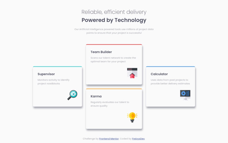
Four Card Feature Section
Design comparison
Community feedback
- @AdrianoEscarabotePosted over 2 years ago
Hi Freivys Paredes, how are you? Welcome to the front-end mentor community! I really liked the result of your project, but I have some tips that I think you will enjoy:
<h2 class="header__h2">Reliable, efficient delivery</h2>
<h3 class="header__h3">Powered by Technology</h3>
The most appropriate in this case would be just an
h1tag! containing the two contents, to make them break a line, we can use a max-width, and for the styling we can use a span element with the content that will be changed!The rest is great!
I hope it helps... 👍
0@FreivysDevPosted over 2 years agoHi @AdrianoEscarabote Thanks for your suggestion, at first I thought about placing the header in an H1 but hesitated. Thanks for the suggestion, I'll make the change.
1 - Account deleted
Hey there! 👋 Here are some suggestions to help improve your code:
- To properly center your content to your page, you will want to add the following to your
bodyelement (this method uses CSS Grid):
body {
    min-height: 100vh;
    display: grid;
    place-content: center;
}
More Info:📚
[Centering in CSS][https://moderncss.dev/complete-guide-to-centering-in-css/]
- Remove this
divas is not neededdiv class="container">.
- The “Reliable, efficient delivery Powered by Technology” is one single heading so the entire thing should be wrapped in a single
h1heading along with aspanelement.
- The
articleelement is not the best choice for wrapping these individual cards. In order to use thearticleelement the component needs to be able to make sense on its own and be independently distributable (can be used in on another site).
- The “icons” serve no other purpose than to be decorative; They add no value. Their
Alt Tagshould left blank and have anaria-hidden=“true”to hide them from assistive technology.
- Using
CSS GridwithGrid-Template-Areaswill make things way easier when building the layout; it will give you full control of the layout.
Here is an example of how it works: EXAMPLE
If you have any questions or need further clarification, feel free to reach out to me.
Happy Coding! 🍂🦃
0@Bilel-mwihbiPosted over 2 years agoHello @vcarames thank you for these useful tips , i didnt catch the "article element is not the best choice" part. Could you pls re-explain it ? thanks for considering my request.
0Account deleted@Bilel-mwihbi
I am glad that I was able to help you out!
Regarding the
articleelement. In to able to use it, the content that is being wrapped by it has...- To be able make sense on its own (no other content around it, just the that single component in a blank page)
- Be independently distributable (think Yahoo, ads, weather widgets, etc...)
So ad are great example, because it it checks off both the requirements. Yo can place anywhere, on any website with whatever content around it and it still makes sense.
For the this challenge, lets keep the "Karma" card and delete everything else around it, can it stand on its own and use it a different website(do users know what it is for, is it complete, etc...)?
Hope this helps making it easier to understand.
Keep it up!
1@FreivysDevPosted over 2 years agoHi @vcarames Thanks for your suggestions, I will apply the changes to the code.
- Regarding the solution of using Grid-Template-Areas, it seemed to me that it is an easy way to solve the positioning of the cards, I had not used almost nothing of CSS Grid.
- On the other hand, it is clear to me that it is not the best option to use the article element, but I would like to know if there is an alternative semantic label to the Div to contain the cards. Thank you
0 - To properly center your content to your page, you will want to add the following to your
Please log in to post a comment
Log in with GitHubJoin our Discord community
Join thousands of Frontend Mentor community members taking the challenges, sharing resources, helping each other, and chatting about all things front-end!
Join our Discord
