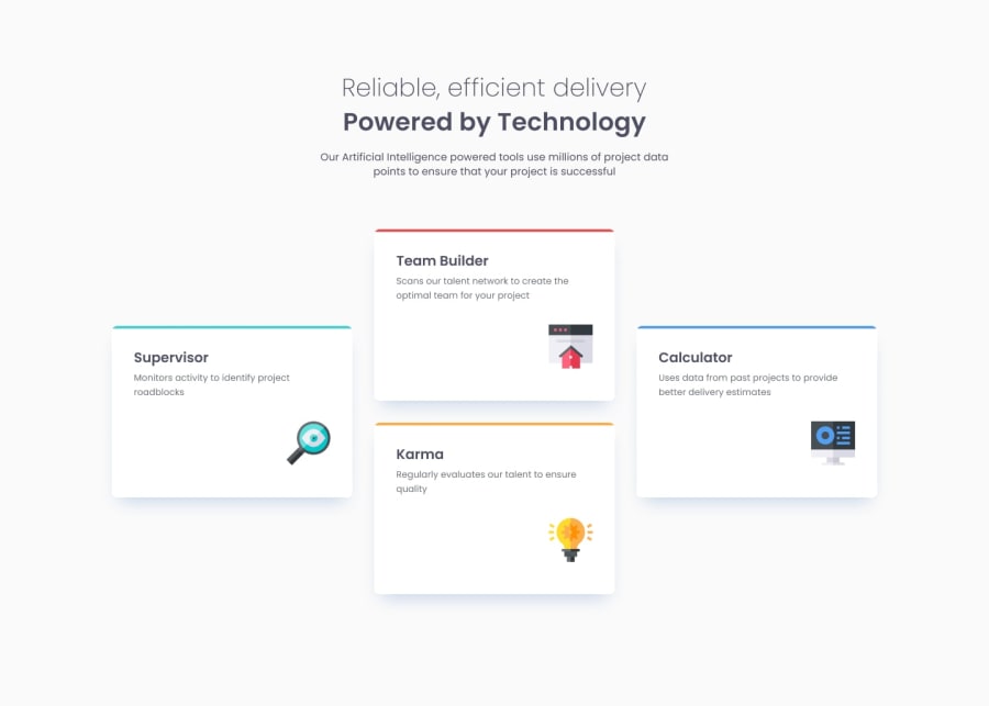
Four card feature section
Design comparison
Community feedback
- @correlucasPosted over 2 years ago
👾Hello Mahdi, congratulations for your solution!
Your solution is just great and super responsive. I like how the cards are flexible here. Well done!
The only thing I think you can improve it, is the shadow because its too dark (maybe the challenge shadow is like this) but you can give it less
opacityand moreblurto have an smoother shadow.👾Hello , congratulations for your new solution!
Marked as helpful1@MahdiRezaeiDevPosted over 2 years ago@correlucas Thank you, I read about shadows and how to have beautiful shadows, I will consider this tip for future challenges.
1 - @asifakram74Posted over 2 years ago
Your solution is just great and super responsive and I love how flexible the cards are here. Great! You must used comment after or before article or section so its more semantic. the one more thing the spacing between card and content should be as per design.
The one more thing I think you can improve is the shadow as it's too dark (maybe that's the challenge shadow) but you can give it less opacity and more blur to get a smoother shadow.
1
Please log in to post a comment
Log in with GitHubJoin our Discord community
Join thousands of Frontend Mentor community members taking the challenges, sharing resources, helping each other, and chatting about all things front-end!
Join our Discord
