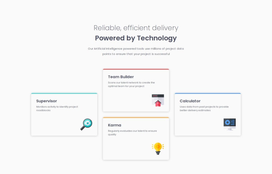
Design comparison
Community feedback
- @artemkotko14Posted 4 months ago
Congrats, you have done a great job! I can only suggest a couple of changes to your code:
- Specify
alton your images. This text helps screen-reading tools describe images to visually impaired readers and allows search engines to better crawl and rank your website. So it's a good habbit to always include that. - You are using 90rem for your media query. On a full size of my laptop screen I can still see a mobile design. I would suggest to use something between 40-60 rem. Hope this will help. Keep on coding!!!
Marked as helpful0@ZxjklpPosted 4 months agoHi @artemkotko14,
- If the images are purely decorative and do not add any meaningful content or context, you can use an empty
altattribute. This will ensure that screen readers skip these images, improving the accessibility experience for users who rely on them.
- The media query breakpoint of 90rem (1440px) is based on the design specifications provided in the
style-guide.mdfile, which suggests 1440px for desktop layouts.
However, I understand that screen sizes and resolutions can vary. If you are experiencing issues with the layout on your laptop, I can adjust the breakpoint to better accommodate different screen sizes. For example, I can lower the breakpoint to 75rem (1200px) to ensure the desktop design appears on more devices.
This adjustment should help ensure that the desktop design appears on more devices, including your laptop. Please let me know if this resolves the issue or if further adjustments are needed.
0@artemkotko14Posted 4 months agoHi, @Zxjklp
The style-guide.md file provides only sizes of the screen that were used in the given designs that provided to the challange. It doesn't mean you need to have a media query breakpoint at this size. So I don't have any issues with that, it's just that I can see your desktop design only through inspecting your page and changing the widths manually. Which is not a great user experience, in my opinion. Just imagine, if that would be a real website, lots of people would be able to see only a mobile version of your page even at laptops or desktop computers.
But again, it's just a suggestion, you can keep the way it is if you like it. Hope you get my point. Cheers!
Marked as helpful0 - Specify
Please log in to post a comment
Log in with GitHubJoin our Discord community
Join thousands of Frontend Mentor community members taking the challenges, sharing resources, helping each other, and chatting about all things front-end!
Join our Discord
