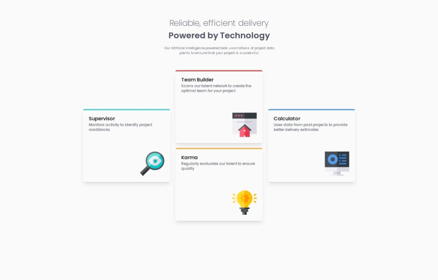
Four card feature section


Design comparison

Community feedback
- @rafbar2000rrPosted 6 months ago
When resizing the window to mobil, I noticed that the card's width decreases as I move. In order to turn from desktop to mobil with a fixed width I would add on each of the four sections on App.tsx this: <section className = "max-w-[365px]"> .
Besides I noticed that the heading and the group of cards didn't move together as I resized the window, so I would add on App.tsx: flex, flex-col and items-center classes this way: <div className='App flex flex-col items-center'>
Marked as helpful0@herojk64Posted 6 months ago@rafbar2000rr max-width on card component is an good idea and flex is good idea but it only applies for single page like this ones so it slipped out of my mind since i been making lots of projects and stuffs thanks for the info.
1

Please log in to post a comment
Log in with GitHub
Join our Discord community
Join thousands of Frontend Mentor community members taking the challenges, sharing resources, helping each other, and chatting about all things front-end!
Join our Discord