Submitted over 1 year agoA solution to the Four card feature section challenge
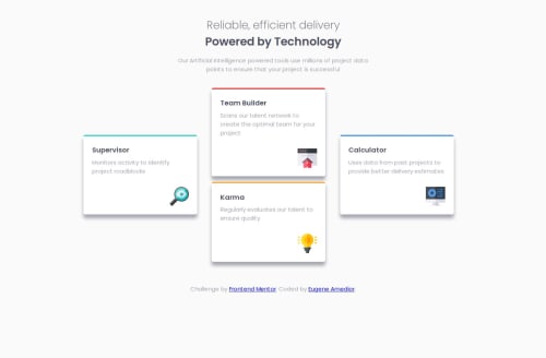
Four Card Feature Section
react, sass/scss, typescript, vite

@Eugene-ak
Solution retrospective
What are you most proud of, and what would you do differently next time?
I was able to use grid to determine my layout despite this being my first project working with css grid.
What challenges did you encounter, and how did you overcome them?I have to say I faced a little challenge figuring my way around grid but I was successful in the end.
What specific areas of your project would you like help with?I have to practice more on planning layouts using grid as it serves as a better solution as compared to flexbox.
Code
Loading...
Please log in to post a comment
Log in with GitHubCommunity feedback
No feedback yet. Be the first to give feedback on Eugene Amedior's solution.
Join our Discord community
Join thousands of Frontend Mentor community members taking the challenges, sharing resources, helping each other, and chatting about all things front-end!
Join our Discord