Design comparison
Solution retrospective
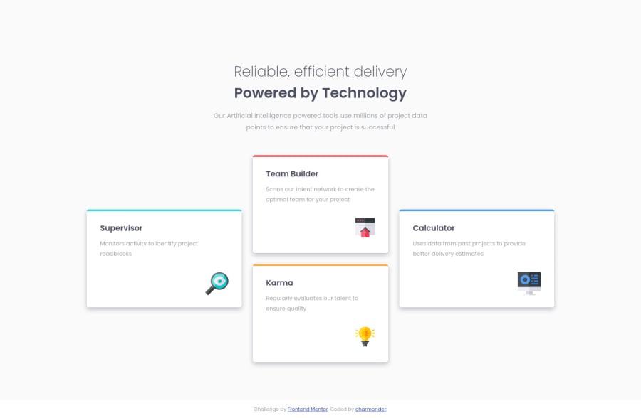
Hello, everyone! I'm trying to finish all the Newbie challenges. Hope I do well in this challenge :) Looking forward to your feedback!
Community feedback
- @correlucasPosted over 2 years ago
🔥 Hello Charmonder! Congratulations for your new challenge bro!
Your solution is really good, there's only a little problem with the
cardsthat are not working properly when it scales down.🔥 I've inspected your code and is some fixed
heightyou've applied, see the code below:.supervisor, .builder, .karma, .calculator { /* height: 220px; */ }🔥 There's no need to set
heightfor this element, what will make the height grows is the elements itself and the padding between the img, paragraph and h1.🔥 The
box-shadowseems a little bit too strong, maybe you can give it a little bit lessopacityto blend the background.🔥 And if you want to keep it super super responsive, maybe you can a media query more making the cards into two columns with two cards, around 768px.
Well done Charmonder!
Hope it helps, and happy coding bro!
Marked as helpful1
Please log in to post a comment
Log in with GitHubJoin our Discord community
Join thousands of Frontend Mentor community members taking the challenges, sharing resources, helping each other, and chatting about all things front-end!
Join our Discord
