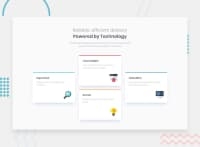
Design comparison
Community feedback
- @Sdann26Posted over 2 years ago
Your project has been spectacular, the BEM methodology is very well applied, the design is very good, maybe I would have added a section to include all the cards. Personally I can recommend you to use the attribute
aria-hidden="true"in the icons since you are not giving any value to the alt.I don't have much to say, it's very well done Pavlina, may you do well in your future projects!
Marked as helpful0@PavlinaPsPosted over 2 years ago@Sdann26 Hello Danilo,
thank you very much for your comment, I appreciate it.
You are right, I should have put aria-hidden="true" since the icons are only decorative. I am going to add it.
Thanks again, have a great day!
1
Please log in to post a comment
Log in with GitHubJoin our Discord community
Join thousands of Frontend Mentor community members taking the challenges, sharing resources, helping each other, and chatting about all things front-end!
Join our Discord

