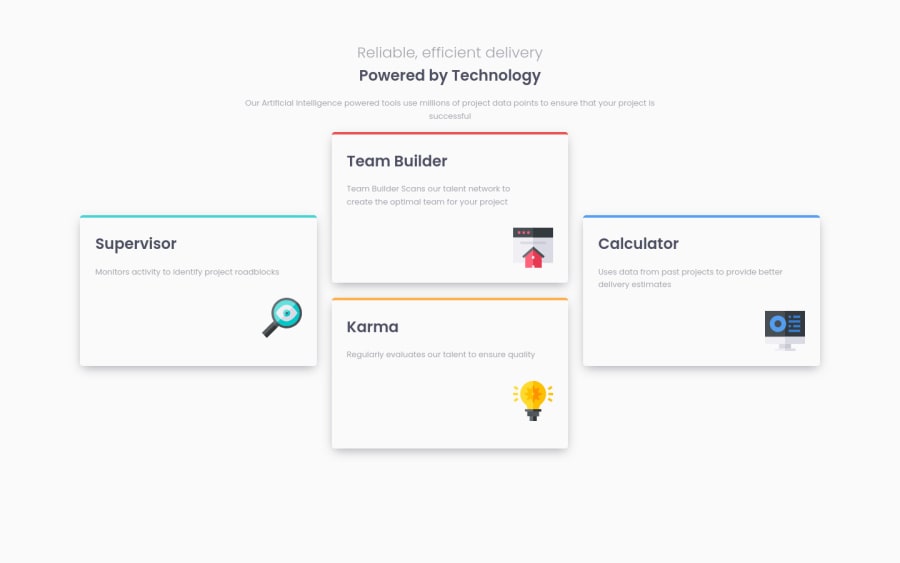
Design comparison
Solution retrospective
Hi need advice for responsive font size 🙏
Please log in to post a comment
Log in with GitHubCommunity feedback
- @isprutfromua
Hi there. You did a good job 😎
keep improving your programming skills🛠️
your solution looks great, however, if you want to improve it, you can follow these steps:
- @import prevents parallel downloads, use <link> instead.
1. @import url("https://fonts.googleapis.com/css2?family=Poppins:wght@300;400;600&display=swap");-
Use relative units for font size, such as ems or rems. While modern browsers can smoothly zoom pixel-based layouts, sizing type in relative units ensures an entire layout can be scaled up or down by simply updating the font-size of the body element.
-
You Need to Stop Targeting Tags in CSS. When you add CSS directly on tags, your markup can’t change. Your style is tightly coupled to your DOM, and any change increases the risk of breaking things.
I hope my feedback will be helpful. You can mark it as useful if so 👍
Good luck and fun coding 🤝⌨️
Marked as helpful - @pikapikamart
Hey, great work on this one. The desktop layout looks really nice, the site is responsive and the mobile state looks really nice as well.
Others already gave their feedback which is nice to see, just going to add some suggestions as well and don't mind me if I re-iterate some ideas mentioned already:>
- For the
scsspart, you don't really need to use:
body {
  .... other selectors
}
You can just directly target the selectors like
.container, this way you reduce specificity. Also, if you like, you can search aboutbemconvention. This will help you manage css selectors and create more generic classes. For example, you will have something like:.cards{ &__container {} &__list{} &__item{} }This way, you can group them properly if you think about it.
- Adding
max-widthon thebodytag to prevent the layout from stretching. If you try to zoom out on your browser, you'll see that the layout stretches, addingmax-widthwill prevent that, just make sure to addmargin: 0 autoso that thebodywill be centered. - These two text:
Reliable, efficient delivery
Powered by Technology
Are just one single phrase, meaning instead of using
ptag for the first one, use a singleh1to wrap both lines and just addmax-widthon theh1so that it will limit and create that 2 lines.- The overall
font-sizescould be bigger, right now some text are small and they are smaller than the design as well. - Remember to only use a single
h1for a site. Theh1typically use on the hero heading like the 2 lines above on the site. So each of the card titles could be replace by justh2. - Each images could use an
aria-hidden="true"attribute so that it will be totally hidden.
Those only. Again, great job on this one.
- For the
- @kenreibman
Professionally and personally I use the clamp() function for truly responsive typography. This will genuinely take your responsive game up to a professional level.
Check out this video: https://youtu.be/U9VF-4euyRo
- @LiyanNguyen
for responsive font-size I personally use these methods:
- use rem units, and change them via @media query for different viewports
- use width% percentages (depending on the container of the text)
- use vh/vw (I rarely use this but sometimes more convenient)
Join our Discord community
Join thousands of Frontend Mentor community members taking the challenges, sharing resources, helping each other, and chatting about all things front-end!
Join our Discord
