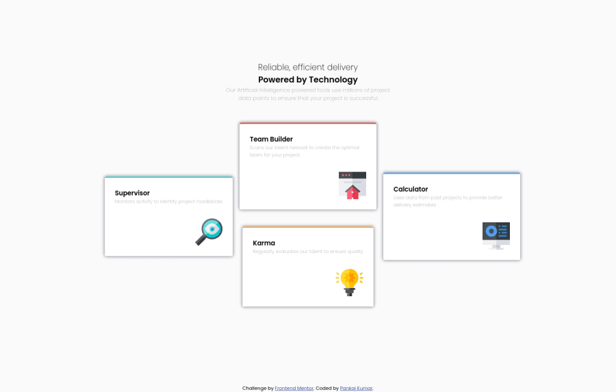
Design comparison
SolutionDesign
Solution retrospective
Hi,
Happy New Year. May this year bring happiness and joy to your life.
Here is my solution for this challenge. Please provide your valuable feedback and suggestions. Happy coding :)
Community feedback
- @vanzasetiaPosted almost 2 years ago
Hi, Pankaj! Happy new year too!
Here are some suggestions for improvements.
- Use visible heading instead of visually hidden heading. You can make "Reliable, efficient delivery powered by technology", as a
<h1>. - Also, that text should be wrapped by one heading. It is a sentence.
- Remove
<h2 class="sr-only">Heading for section</h2>. There is no need to add visually hidden headings. (Try not to overthink accessibility.) - Setting
display: noneto.sr-onlywill hide the HTML element from everyone including assistive technologies. So, use the following styling instead for visually hidden class — Improved .sr-only <section>and<article>have no semantic meanings unless you label them witharia-labeloraria-labelledby. So, don't overuse them. You can replace them with<div>instead. Source: WebAIM: HTML Semantics and Accessibility Cheat Sheet
I hope this helps. Happy coding too!
Marked as helpful1 - Use visible heading instead of visually hidden heading. You can make "Reliable, efficient delivery powered by technology", as a
Please log in to post a comment
Log in with GitHubJoin our Discord community
Join thousands of Frontend Mentor community members taking the challenges, sharing resources, helping each other, and chatting about all things front-end!
Join our Discord
