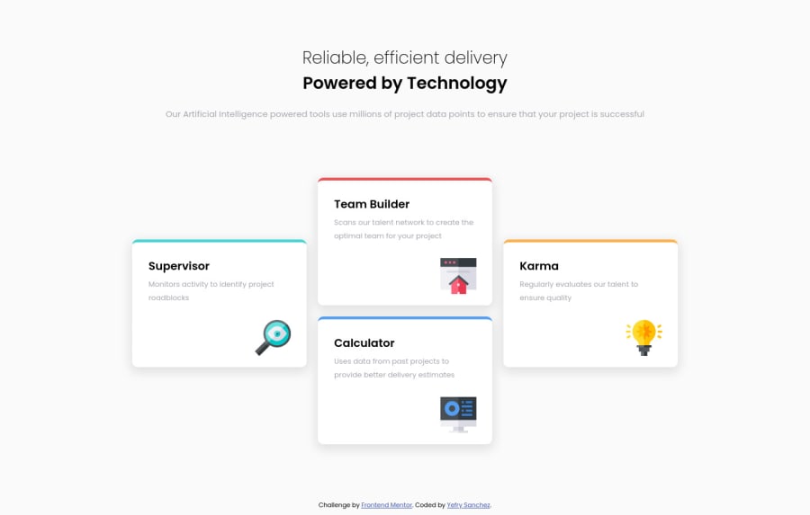
Design comparison
Solution retrospective
This challenge was a little bit hard for me, any feedback is appreciated.
Community feedback
- @correlucasPosted over 2 years ago
👾Hello Yefry, congratulations for your new solution!
Your solution is just great, I liked a lots the work you've done with the sibling selector to make the icon spin when the card get hovered, this a thing that is not many person are aware that is possible to do only with CSS. You did great.
My only advice for your is give less
opacityand moreblurto your shadows, this way you'll have a smoother shadow and a better look. You can play this shadows values using Figma or event the code manager in the Google Chrome devtools.👋 I hope this helps you and happy coding!
Marked as helpful1@y25sanchezPosted over 2 years ago@correlucas thanks Lucas. I just changed the box shadow.
0 - @k-stopczynskaPosted over 2 years ago
Hi!
congratulations on completing the challenge, looks really great:)
One thing I've noticed: on desktop your Karma and Calculator sections are not really in their designed places. You could easily fix it using grid instead of flex. Then you can point exact grid-area on any element.
Happy coding!
Marked as helpful0@y25sanchezPosted over 2 years ago@k-stopczynska thank your so much for the feedback, I just made the changes.
0
Please log in to post a comment
Log in with GitHubJoin our Discord community
Join thousands of Frontend Mentor community members taking the challenges, sharing resources, helping each other, and chatting about all things front-end!
Join our Discord
