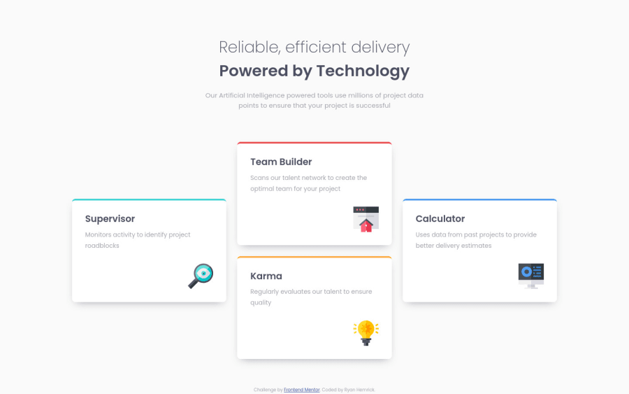
Design comparison
Solution retrospective
Hi! I used this project as an opportunity to continue practicing with CSS Grid properties, writing mobile-first CSS, and using more responsive units (instead of using px) for my paddings, margins, and media queries.
Feel free to leave any recommendations and feedback for improving the HTML or CSS!
Community feedback
- @VCaramesPosted almost 2 years ago
Hey there! 👋 Here are some suggestions to help improve your code:
- The
article
element is not the best choice ❌ for wrapping these cards. In order to use thearticle
element the component needs to be able to make sense on its own and be independently distributable (can be used in on another site). instead wrap them indiv
.
More Info:📚
- The “icons” in this component are purely decorative. ⚠️ Their
alt tag
should be left blank to hide them from assistive technology.
More Info:📚
https://www.w3.org/WAI/tutorials/images/
- Using
CSS Grid
withGrid-Template-Areas
will make things way easier 💯 when building the layout; it will give you full control of the layout.
Here is an example of how it works: EXAMPLE
If you have any questions or need further clarification, feel free to reach out to me.
Happy Coding! 🎆🎊🪅
Marked as helpful1@Ryan-HemrickPosted almost 2 years ago@vcarames I was definitely doubting myself when I started using the
article
element for the cards. What you mentioned makes sense to me. I've been shying away from usingdiv
elements in an attempt to be more semantic, but I definitely need more context on when to use different tags.I read through the article that you linked about images. It was very informative! I was just throwing
alt
text on everything.In my last couple of projects, I created alternate CSS files that used
grid-template-areas
instead of the way that I did it here, and I think I need to get more comfortable with that approach. I think the syntax of it has been a bit tricky to memorize.Thanks!
1@VCaramesPosted almost 2 years ago@Ryan-Hemrick
The
div
is the most commonly used element, so don’t shy away from them. A common mistake a lot of people make is trying to make everything 100% semantically correct, that they end up using the elements incorrectly in the process.If they’re illustration or icons, they are 100% purely decorative. It becomes a little bit more trickier when it’s a real image. That’s when you’ll have to use your instinct to decided if it is decorative or not.
Grid-Template-Areas
is a great tool to use. I will admit though, sometimes it isn’t (if you need to overlap content) but for this challenge and few other ones it is.Keep it up!
Marked as helpful1 - The
Please log in to post a comment
Log in with GitHubJoin our Discord community
Join thousands of Frontend Mentor community members taking the challenges, sharing resources, helping each other, and chatting about all things front-end!
Join our Discord