Design comparison
SolutionDesign
Solution retrospective
What challenges did you encounter, and how did you overcome them?
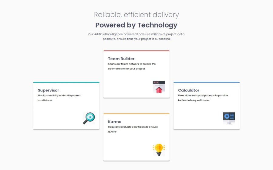
The layout. Tried flex first, but switched to grid after.
What specific areas of your project would you like help with?Any feedback is welcome.
Specificaly: -choice of components -the code in general? Is it clean? Can I improve something -CSS, I've seperated each components css, is it ok like this? Should I take a different approach
Community feedback
Please log in to post a comment
Log in with GitHubJoin our Discord community
Join thousands of Frontend Mentor community members taking the challenges, sharing resources, helping each other, and chatting about all things front-end!
Join our Discord
