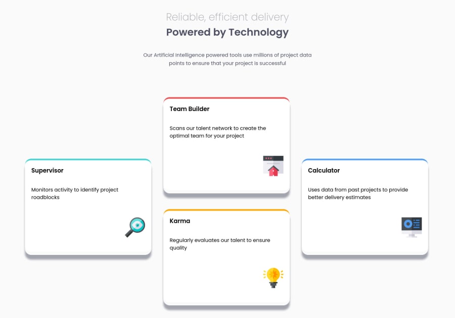
Design comparison
Community feedback
- @HassiaiPosted almost 2 years ago
Replace <container class="page"> with the main tag and <h1 class="top-title"> with <p> to fix the accessibility issue. click here for more on web-accessibility and semantic html
To center .page on the page, add min-height:100vh; display: flex; align-items: center: justify-content: center; or min-height:100vh; display: grid place-items: center to the body.
Give the box-shadow of .card hsla(212, 86%, 64%,0.1)
Use rem or em as unit for the padding, margin, width and preferably rem for the font-size for more on CSS units Click here
Hope am helpful.
Well done for completing this challenge. HAPPY CODING
Marked as helpful1
Please log in to post a comment
Log in with GitHubJoin our Discord community
Join thousands of Frontend Mentor community members taking the challenges, sharing resources, helping each other, and chatting about all things front-end!
Join our Discord
