Submitted over 1 year agoA solution to the Four card feature section challenge
Four card feature section
@EdoardoRamondetti

Solution retrospective
What challenges did you encounter, and how did you overcome them?
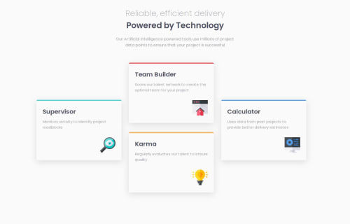
i have had some problems with positioning the cards on the desktop view. I overcome them with display grid on the container of the cards and with this on every card: position: absolute; top: 50%; left: 0; right: 0; transform: translateY(-50%);
What specific areas of your project would you like help with?i would know if there is a better way to position the card than my solution. but I would appreciate any advice to improve.
Code
Loading...
Please log in to post a comment
Log in with GitHubCommunity feedback
No feedback yet. Be the first to give feedback on Julien's solution.
Join our Discord community
Join thousands of Frontend Mentor community members taking the challenges, sharing resources, helping each other, and chatting about all things front-end!
Join our Discord