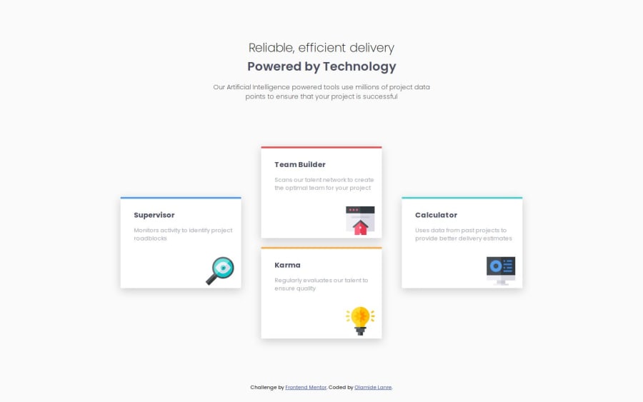
Design comparison
Solution retrospective
How hard I tried to figure out the desktop view without using ai lol
What challenges did you encounter, and how did you overcome them?The desktop view was a challenge for me, I was on the right track with my html structure but my inadeqaute knowledge on flex and grid held me back. A friend helped me over come by giving a simple explanation.
What specific areas of your project would you like help with?Well I left the mobile view for ipad mini and ipad air tablet, I know my responsiveness is not as strong yet, especially for the tablet cause I belive it's meant to take up most of the space of a screen but on the ipad pro it leaves alot of space at the bottom and the contents are just in their positions(you can check this out on the screens provided by your browser and give me feedback pls). Any tips on how to fix this?
Community feedback
Please log in to post a comment
Log in with GitHubJoin our Discord community
Join thousands of Frontend Mentor community members taking the challenges, sharing resources, helping each other, and chatting about all things front-end!
Join our Discord
