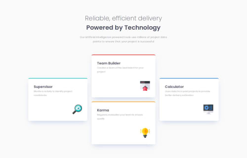
Submitted over 1 year agoA solution to the Four card feature section challenge
Four card feature section
@andiaz

Solution retrospective
What are you most proud of, and what would you do differently next time?
Getting the 3 columns to work as intended! I had a plan when using flexbox which turned out quite nice :)
What challenges did you encounter, and how did you overcome them?Making the boxes as even as possible in terms of size. I had to read up a bit on flex-basis and felt as if I had to go back and forth many times to ensure things were working as intended.
What specific areas of your project would you like help with?Any kind of feedback is welcome really, but I want to ensure I am using best practices for my code and techniques. So feedback on that is always welcome, both in terms of HTML and CSS :)
Code
Loading...
Please log in to post a comment
Log in with GitHubCommunity feedback
No feedback yet. Be the first to give feedback on andiaz's solution.
Join our Discord community
Join thousands of Frontend Mentor community members taking the challenges, sharing resources, helping each other, and chatting about all things front-end!
Join our Discord