Design comparison
SolutionDesign
Please log in to post a comment
Log in with GitHubCommunity feedback
- @Bunchydo
Hi daurygg, I hope all is well.
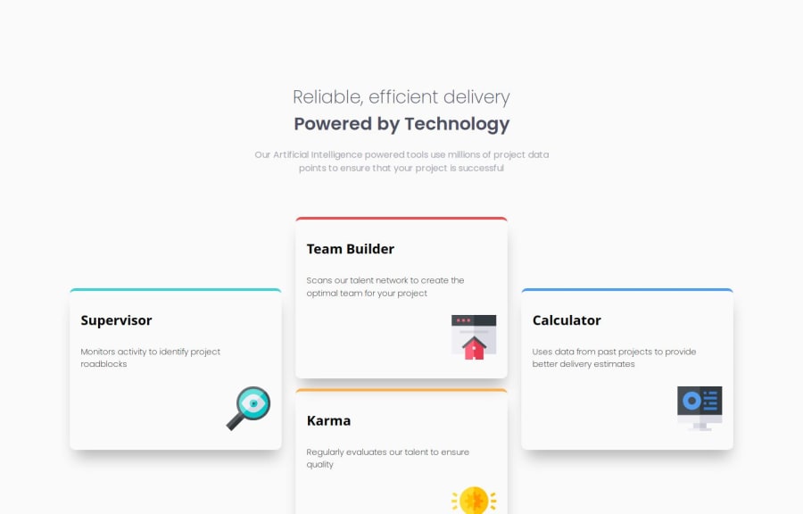
I really liked how the website turned out. Just one question. When the screen size is reduced, was the overflow on the x axis intentional? I was thinking maybe the elements could be reduced in size just a little more to make it fit between the chosen screen size for the mobile media query.
Well done!!
Join our Discord community
Join thousands of Frontend Mentor community members taking the challenges, sharing resources, helping each other, and chatting about all things front-end!
Join our Discord
