Design comparison
Solution retrospective
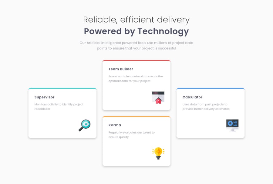
Hello ! This is my approach for the 'Four-Card-Feature-Section' challenge.If there are any things I could do to make my code 'cleaner' or if there are any other approaches to design structure , I would like to listen to your suggestions.
Community feedback
- @AbsorberendPosted about 2 years ago
My man! Looks good!
One thing you might try is adding some more CSS to your 48em media query to give the feature-box'es some more room to expand/breath. They seem to get pretty cramped at this resolution size. Here is what I came up with:
@media (max-width: 48em) {
  .container {
    padding: 0 2rem;
  }

  .feature-box {
    padding: 2.2rem;
  }

  .imgBx {
    margin-top: 2rem;
  }
}
I think your code is really clean man, but in terms of readability I like to use pixels instead of "em" for my media queries so I instantly know what I'm looking at. But that might be personal preference. Also maybe add some comments in your CSS (just like you did in your media queries CSS file) to improve readability.
Marked as helpful0
Please log in to post a comment
Log in with GitHubJoin our Discord community
Join thousands of Frontend Mentor community members taking the challenges, sharing resources, helping each other, and chatting about all things front-end!
Join our Discord
