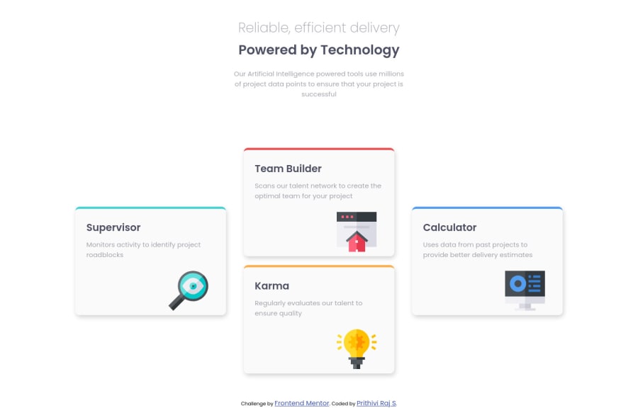
Design comparison
Solution retrospective
All feedback's are welcome, Thank you
Community feedback
- @grace-snowPosted almost 2 years ago
Hello
I'm afraid you've got overflow bugs in this and it's not fully responsive.
A big part of the problems come from using
width: 100vw
. You never want to use 100vw anywhere, because it doesn't account for scrollbars or device notches. So you are effectively telling the browser you want something to be "100% + scrollbar width wide". That then causes a horizontal scroll to appear.Similarly, you never want to limit height to 100vh. You need to use min-height instead so the contents can grow when they need to.
It looks like you have some report errors that need fixing above. You definitely should not be using h4s for those paragraphs.
I'll add that I think you've used the body background for the cards and vise-versa.
I strongly recommend you refactor the HTML and css approach in this. It is a CSS grid challenge. That's what the design is there to teach. You will learn a lot by building this grid with CSS grid instead of attempting it with flexbox. Grid is made for this.
Marked as helpful1@prithiviraj275Posted almost 2 years ago@grace-snow , Hi grace, I have improved my solution based on your suggestion. Thanks for your suggestion. Please check my new solution and let me know where I need to improve.
thank you!!
0@grace-snowPosted over 1 year ago@prithiviraj275 it looks like you still have overflow bugs here.
- You are still using
width: 100vw;
which you should never use anywhere - You've used min-height on the body but no flex or grid properties to make the page content centered on the page
- You're not using grid properly for the actual grid of cards. Every 'box' should be a direct child of
c2
if that is your grid. None of the boxes should have margin. You should be using grid-template properties to set up the grid and all sizes, gap to create the spaces between. The boxes themselves must not have any height or width sizing on them, they will only need placing onto (positioning within) that grid template.
Open devtools on the side of your screen. Zoom in/out in the viewport, and drag the devtools wider to shrink your viewport. You will see all the problems I am seeing
Marked as helpful0@prithiviraj275Posted over 1 year ago@grace-snow , Thanks grace, will check this and update my solutions
0 - You are still using
Please log in to post a comment
Log in with GitHubJoin our Discord community
Join thousands of Frontend Mentor community members taking the challenges, sharing resources, helping each other, and chatting about all things front-end!
Join our Discord