Design comparison
SolutionDesign
Solution retrospective
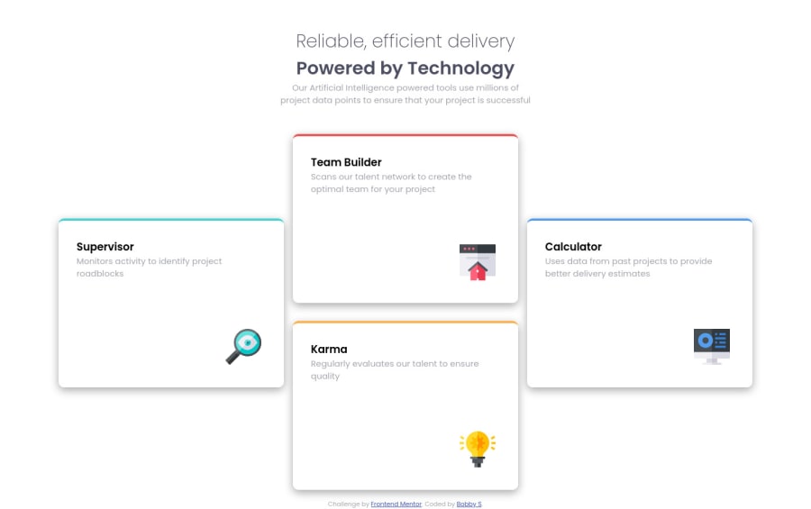
I am happy with the final result of this challenge. I really like how the grid turned out for all three breakpoints. I used transform:translateY(50%) to offset the two cards on the left and right. This really was an easy challenge. Any feed back is greatly appreciated.
Community feedback
Please log in to post a comment
Log in with GitHubJoin our Discord community
Join thousands of Frontend Mentor community members taking the challenges, sharing resources, helping each other, and chatting about all things front-end!
Join our Discord
