

Design comparison

Solution retrospective
This was a good work! Hopefully Frontend mentor doesnt reduce the height like theyve been doing to my other works
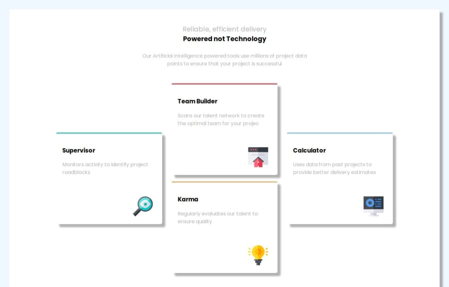
What challenges did you encounter, and how did you overcome them?Aligning the cards
Community feedback
- @AdrianoEscarabotePosted about 1 month ago
Hi Andymiguel25, how’s everything? I think your project turned out great! However, I have some feedback that I think might be useful:
You have used <br> , using <br> is not only bad practice, it is problematic for people who navigate with the aid of screen reading technology. Screen readers may announce the presence of the element. This can be a confusing and frustrating experience for the person using the screen reader.
The rest is amazing.
I hope this is helpful. 👍
0 - @Solataiwo-15Posted about 1 month ago
You can align the cards well using CSS Grid...It is very useful. Nice work regardless!
0


Please log in to post a comment
Log in with GitHubJoin our Discord community
Join thousands of Frontend Mentor community members taking the challenges, sharing resources, helping each other, and chatting about all things front-end!
Join our Discord