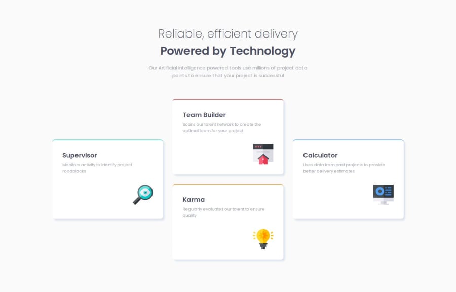


Design comparison

Solution retrospective
I had to experiment a bit with Flexbox because the elements didn't always occupy the intended space as I had planned.
What specific areas of your project would you like help with?I would appreciate some general tips on using Flexbox for layout and feedback on whether I've made any mistakes or if there are better approaches I could use.
Community feedback
- @TedJenklerPosted 7 months ago
Hi @Jan-Dev0,
Nice job on the project! I noticed a small issue with responsiveness. I’d recommend always using rem or % for sizing, and avoiding fixed widths—use max-width and min-width instead. Like mentioned in previous feedback, the easiest way to tackle this challenge is by using Grid, but it’s totally doable with Flexbox if you play around with media queries. You could use three flex parents, though Grid is generally recommended for more control.
On several breakpoints, there are width and height inconsistencies. I’d suggest looking into that and trying to use as little CSS as possible—it often simplifies things.
To improve SEO and accessibility, consider using <section> tags instead of <div>, with aria-label, aria-labelledby, or title attributes to make the content more accessible.
Your code is heavily nested with <div> elements. For the next project, I’d recommend minimizing the use of <div>s to keep the code cleaner and more readable. For instance, using flex-column or flex-row instead of extra <div> containers can help organize and stack elements more efficiently.
Keep up the great work!
Best, Teodor
Marked as helpful1 - @aymenthedeveloperPosted 7 months ago
for a layout like this its better to use grid since it allows us to define the grid cols and rows and then we can use the properties grid-row and grid-column to position each element exactly in the grid, which makes thing much easier.
i personally used flex box for this project when i did it but if i would go back an improve it i will defiantly use grid.
you can check my solution if you want to see how i did it using flex box.
Marked as helpful1


Please log in to post a comment
Log in with GitHub
Join our Discord community
Join thousands of Frontend Mentor community members taking the challenges, sharing resources, helping each other, and chatting about all things front-end!
Join our Discord