Design comparison
Solution retrospective
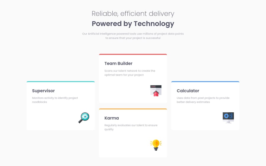
I need help with the first and last tool cards..for some reason when the flex direction is column the first and last cards don't take up their full width, the the two middle cards do(try to resize the screen width to 768ps to see what I'm saying). I've tried debugging this without any luck. Please I would appreciate some help.
Community feedback
- @grace-snowPosted over 3 years ago
Hello
Ideally this should be a css grid solution. Using flexbox is OK but not the best choice for this when css grid is what it was designed for...
Whatever layout method you use, you need to change some html on this
- follow advice given above - heading order matters and articles aren't a great fit for this
- header element should really sit outside of main
- figure element should only be used if an image (or other content) requires a visible caption
- fix errors in your report.
-
Did you mean to use span in the h1?
-
Those images aren't meaningful content so if you want to include them in the html, include an alt attribute (essential for all img elements) but leave its value blank. Otherwise consider using background image instead
The card width problem could be caused by align-items being set to center (but I can't check in browser right now as am on mobile)
In future challenges try to start building styles from mobile first instead. It will cause fewer issues, follow best practices and leave you with shorter simpler css.
I also recommend you get really intentional about units. There's an unusual mixture in this of px em and rem (and %). Use rem for all font sizes, media queries and sometimes other things like widths, and only use em when you need something to scale based on the font size of that element or a parent (eg icons or pseudo elements or button padding can all be a good use case for em)
Good luck
Marked as helpful3 - @vanzasetiaPosted over 3 years ago
More feedback:
- In my opinion, you don't need to wrap a single
articlein adiv. - Use heading tags in chronological order, you need to use
h2first before usingh3. Don't use heading tag only for the size. - When you're writing HTML try to imagine it when it has no styling. Do you think
articleis a good semantic tag in this case? I think it would be better to useulandli. That way you don't need heading tag, just usestrongtag. - The
imgtag always needaltattribute. You can just leave thealt=""attribute with empty value. - Always use
widthandheightattribute on images, it will prevent the shifting layout happening. Don't worry about the styling, you can still control the size on external CSS. You can check this article from Web Dev about Optimize Cumulative Layout Shift.
That's it! Hopefully this is helpful!
Marked as helpful2 - In my opinion, you don't need to wrap a single
- @radikhalPosted over 3 years ago
This comment was deleted over 3 years ago
0@vanzasetiaPosted over 3 years ago@radikhal For the
width: 80%andmax-width: 1400px, they don't fight each other, they work together.Let me explain, the 80% width will make sure that the content is always 80% of the screen width, but when the 80% is bigger than 1400px, the
max-widthwill making sure that the content is no more than 1400px width.0@radikhalPosted over 3 years ago@vanzasetia Oh okay, i didn't know that. Thanks for clarifying 🙏🏾
0 - @afrusselPosted over 3 years ago
As I am checking this on mobile view. I will sure check this on desktop view and give you a solution on tomorrow
0@trafikiPosted over 3 years agoHi @afrussel it happens when you hit the 768px mark. If you view the page on your mobile with landscape mode, you'll see what I'm saying. Thank you
0@vanzasetiaPosted over 3 years ago@trafiki I think you can try to set all direct child to have
flex-basis: 100%so every card should have the same size. Let me know if it works or not!0
Please log in to post a comment
Log in with GitHubJoin our Discord community
Join thousands of Frontend Mentor community members taking the challenges, sharing resources, helping each other, and chatting about all things front-end!
Join our Discord
