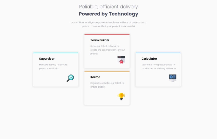
Design comparison
Community feedback
- @Extendo99Posted 6 months ago
You should use a margin at the top of the page.
The tabs should be white on the solution.
The mobile view looks incorrect because it is not centered. The text in the paragraph also has no padding, which is why it touches the edge of the screen.
It's great that there is a tablet view implemented, consisting of 4 tabs in a rectangle :)
The code looks okay, but I would group all the rules for a given media query, e.g. 1024, in one place and media 768 in another, because there is currently some confusion. Once there is media for 1024, then for 768, and then without media, which makes it difficult to read.
0
Please log in to post a comment
Log in with GitHubJoin our Discord community
Join thousands of Frontend Mentor community members taking the challenges, sharing resources, helping each other, and chatting about all things front-end!
Join our Discord
