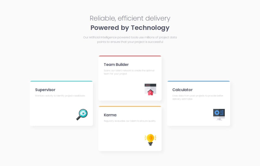
Design comparison
Solution retrospective
Coming up to this project, three of my biggest CSS fears has been grids, SVG handling, and box shadows done tastefully. Needless to say, this beautiful design was a great deep end for all three.
Though, I was surprised that none of these were my biggest issue. The grid was surprisingly intuitive, the SVGs had their own intrinsic sizing properties, and I got the hang of shadow blurring and radius with some trial and error.
The brief said mobile viewport width was 375px. That didn't make sense to me, so I applied one-column breakpoint at 1,160px to prevent horizontal scrolling.
What challenges did you encounter, and how did you overcome them?I can't believe how much time I spent matching the font sizes and vertical spacing.
The first challenge was cat-and-mouse with h1/h2/p margins and massive spacing. I eventually realized I had not reset their default line-height properties.
But the bigger fight was working with different fonts using relative units. It seems each font had its' own distinct line height, so cascading values didn't translate to consistent size. I eventually measured each font's 1rem in pixels, measured the mockup's height in pixels, then divided one by other to get the rem co-efficient. There's a good chance I overthought this, and there's a simpler method I didn't consider.
What specific areas of your project would you like help with?In general I feel a bit torn between chasing pixel perfection and using progressive enhancement principles. It was jarring to study Every Layout, and immediately move on to these design recreation exercises. I guess each approach has their place across different projects, and the nuance will get clearer with more experience.
Community feedback
Please log in to post a comment
Log in with GitHubJoin our Discord community
Join thousands of Frontend Mentor community members taking the challenges, sharing resources, helping each other, and chatting about all things front-end!
Join our Discord
