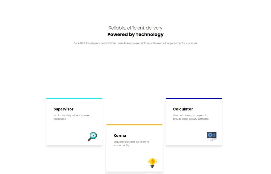
Design comparison
Solution retrospective
I am proud that I was able to complete this challenge to some more success than the last challenge, with a better understanding of HTML and CSS. I understood responsiveness and the @media screen tag to a greater level being able to make the website responsive. Next time I would use the variable of "VH" for width and height to get the cards to be more centered on the screen.
What challenges did you encounter, and how did you overcome them?I faced several challenges throughout the challenge such as laying out the cards in the correct positions as well as getting them to be the correct shape to match the screenshot. I overcame these challenges by looking on stack overflow and finding elements and methods to be able to better place the cards where necessary. To figure out the shape I did my best to match it however, it is still not perfect and there are small errors such as the gap between cards is not identical. I also had challenges with the responsiveness of the tag as well as the main title as they were responsive when I did not want them to be. I solve the issue by incorporating "VH" into my height and width.
What specific areas of your project would you like help with?How can I preview the changes to a website when I do not have a computer that can reach 1440px, how can I make sure that it is changing correctly to that width? What are options to run the challenge locally to view live changes? How can I add margin between the bottom of the last card and the bottom of the screen when reaching the mobile responsiveness of 375px?
Please log in to post a comment
Log in with GitHubCommunity feedback
- @HanzMal
good job eric
Join our Discord community
Join thousands of Frontend Mentor community members taking the challenges, sharing resources, helping each other, and chatting about all things front-end!
Join our Discord
