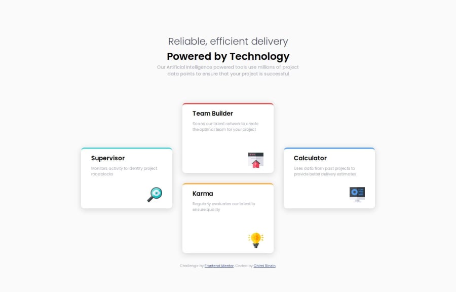
Four Card Feature Master Section using HTML and CSS(Flexbox)
Design comparison
Solution retrospective
I am more familiar with using flexbox and then designing for smaller displays.
What challenges did you encounter, and how did you overcome them?Designing for smaller displays, after finishing the design for larger displays is difficult as you have to undo a lot of changes in order for the designs for smaller designs to work.
Community feedback
- @asyirriPosted 7 months ago
Great Works!
Your solution is close as mine, using pure flexbox not grid layout. For the
.blockcan float in center you use 3 column to seperate each other.For me, if I want to use a smaller display, I just make a simple change
flex direction: column;in the main section media query if this is your case and the rest will follow if you already make.blocksize is same. So you don't have to undo everythingI hope it helps. Good Job.
Marked as helpful1
Please log in to post a comment
Log in with GitHubJoin our Discord community
Join thousands of Frontend Mentor community members taking the challenges, sharing resources, helping each other, and chatting about all things front-end!
Join our Discord
